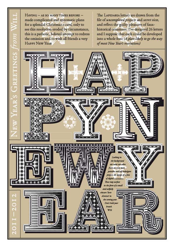
My interest in pattern design began by chance about 15 years ago when experimenting with pattern brushes in Adobe Illustrator. I found that mapping these around small shapes resulted in tight, complex shapes that recalled woodcut ornaments. These found their way into my 2010 New Year card, with the footnote: ‘Lurking in the background are some out-takes from an even more pointless and self-indulgent project; the design of a font of digital fleurons . These may surface in the form of a small and wilfully obscure ‘livre d’artiste’ in the coming year. Don’t hold your breath‘
I don’t remember what became of the livre d’artiste idea, but the font was developed as Stochastic, and was included in David Jury’s Little Book of Typographic Ornament (Laurence King, London 2015)
In traditional metal typesetting, fleurons were used as ornaments within the text, but were also grouped together to form fields of repeat pattern for endpapers and borders. Exploring the digital equivalent through swatches and pattern brushes, I found that the vector tools could be used generate outcomes that were unpredictable but ordered. These were at once surprising and familiar.
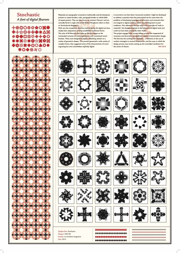
After further experiments I saw affinities with work that had been going on elsewhere: the abstract pattern fonts designed by Zuzana Licko at Émigré, (which I later wrote about in my 2025 review of the Emigré compendium), and the work of designers Hansje van Halem in the Netherlands and Marian Bantjes in Canada. I’d been interested in the reappraisal of pattern and ornament in the post modern architecture of John Outram, Terry Farrell and others, and wrote about this in relation to typeface design in my conference paper Letter, craft and ornament which explored the concept of digital craft. I was also influenced by the use of pattern in the ceramics of Jaqueline Poncelet and Elizabeth Fritsch.
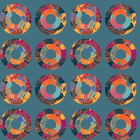
As this project progressed I realised that I was moving into a distinct and unfamiliar professional field: vector pattern design. As I considered licensing these designs commercially I was concerned that this work seemed unrelated to the topics I was best known for as a typographic designer. At one point I considered using my pseudonym Guy Collins (a double transliteration of my name: translated first into French and then back to its anglicised form) but after a while this proved unnecessary, as the pattern work found its way into several design projects – notably a set of business cards for Camena Biosciences – and art works such as the recent ‘Papillon’ series. Playing with seamless swatches led to many experimental designs that had no specific purpose beyond looking good, I filed the results in a folder just titled ‘Pretties’. My associate Harry Gray saw in some of these the possibility for an installation which was to become ‘Pairings’ for the foyer of the Camena Bioscience lab., which can be seen on the page ‘Site-specific work’
A selection from my library of vector swatches can be viewed on the Pattern Design page, and the full library can be viewed on request

Leave a comment