I have worked on a variety of site-specific projects and installations, both as an aspect of my own practice and since 2017 in collaboration with the sculptor Harry Gray.
Cosmographica 2014
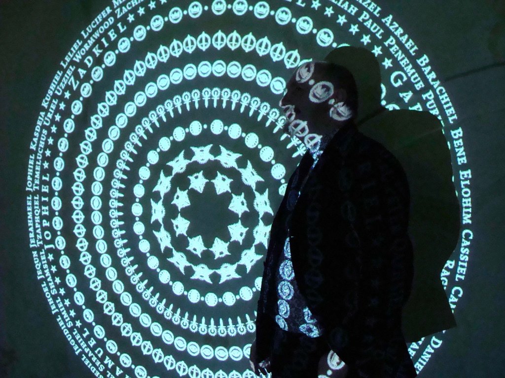
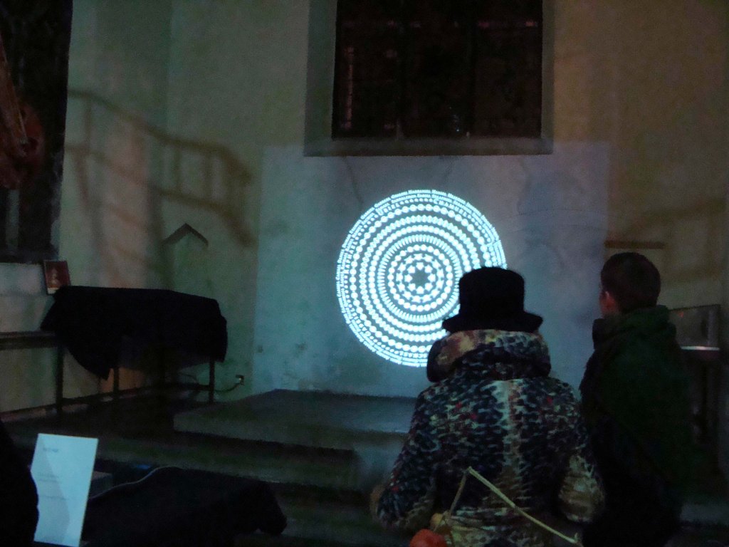
Cosmographica was a site-specific animated projection for the group exhibition ‘Evolution of Angels’ at St Peter Hungate, Norwich in 2014.
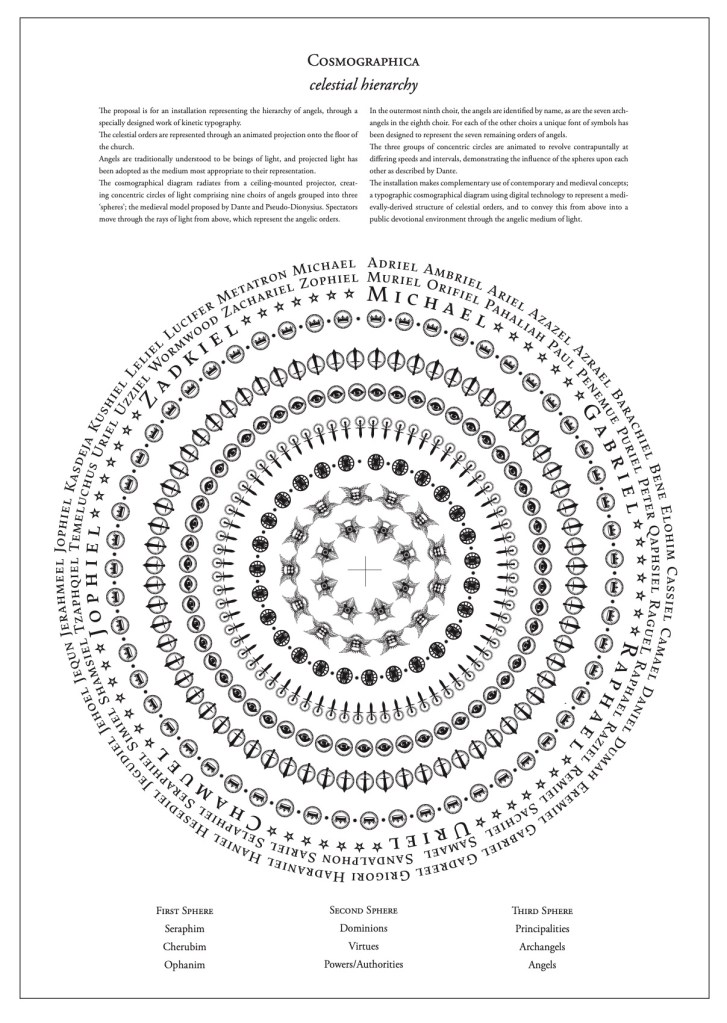
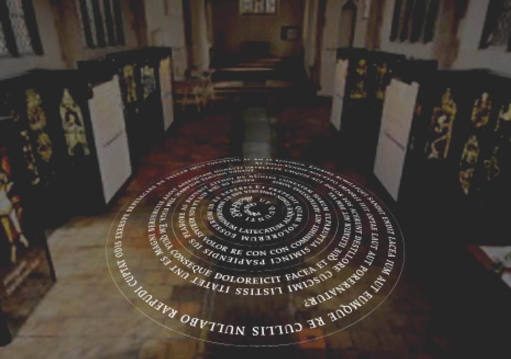
My original plan, as shown in the proposal image above, was for the animated cycles to be projected downward ‘from the heavens’ onto the church floor. Suspending the projector however proved impractical and instead the organisers offered me the main wall of the chancel, which resulted in the unintended effect of a ‘rose window’
View on Vimeo: animation by Diana Scarborough
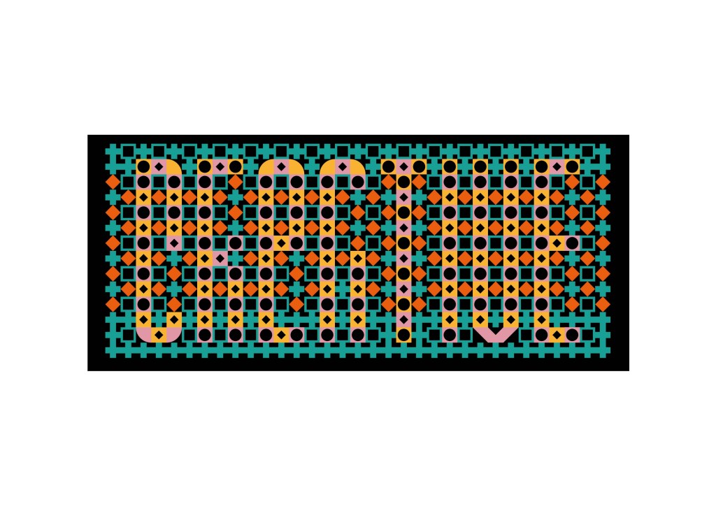
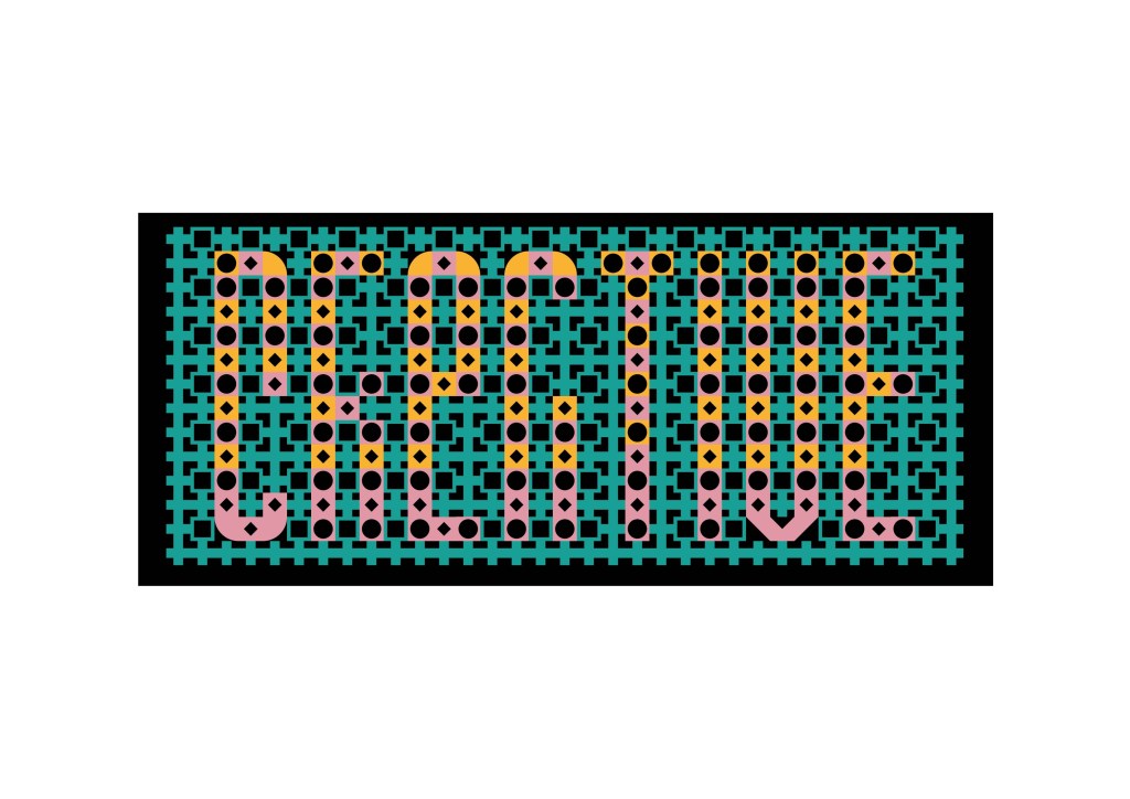
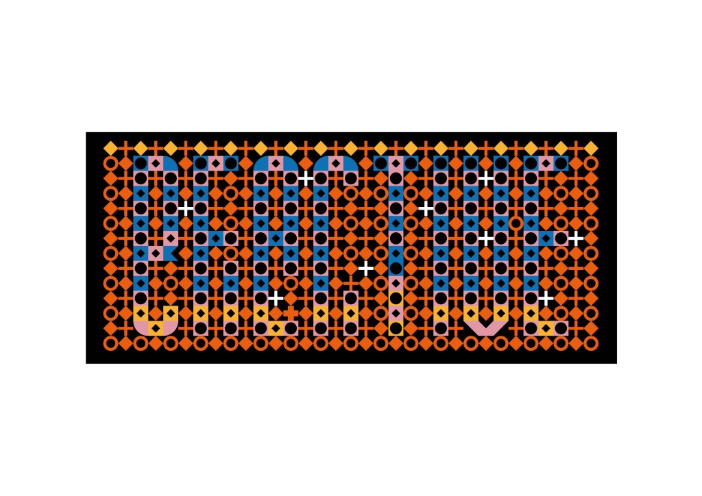
Creative/Reactive 2016
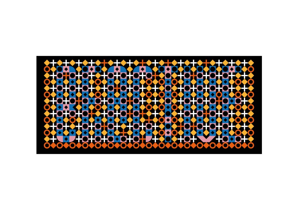
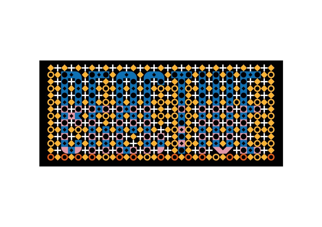
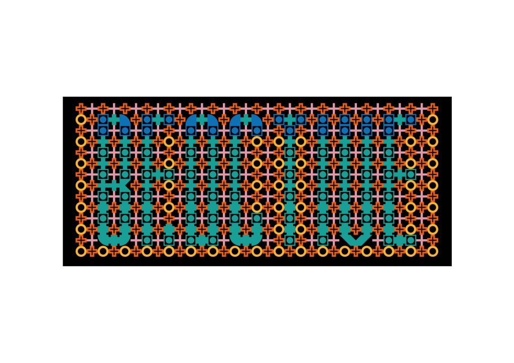
Creative/Reactive was a piece of kinetic typography created for the 2016 ‘Art Language Location’ festival organised in Cambridge by Robert Goode. The modular letterforms prefigure my 2019 typeface Dichromate.
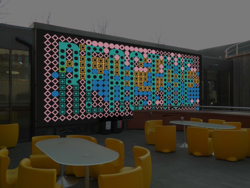
Originally conceived for projection onto the exterior of the building, as shown in the proposal montage above, it was eventually sited above the main stairwell in the School of Art.
The multi-coloured projection uses a specially designed modular system of interchangeable units to make up each letter of a word; a digital font of abstract geometric forms that in turn are used to compose a further font of richly-patterned letterforms. These are intentionally ‘unstable’, as each of the pattern units which form the letters can be independently substituted for a variety of alternatives. Each letter is independently bi-coloured or ‘chromatic’, providing for further permutations of detail and colour.
This system allows for a gradual transition from one word into another, as a complex pattern of substitution alters first the surface pattern and then the actual form of the letter, to make a gradual transition between the words REACTIVE and CREATIVE.
View on Vimeo Animated sequence by Diana Scarborough
In collaboration with Harry Gray as Gray/Hill:
Discover and Acquire 2015
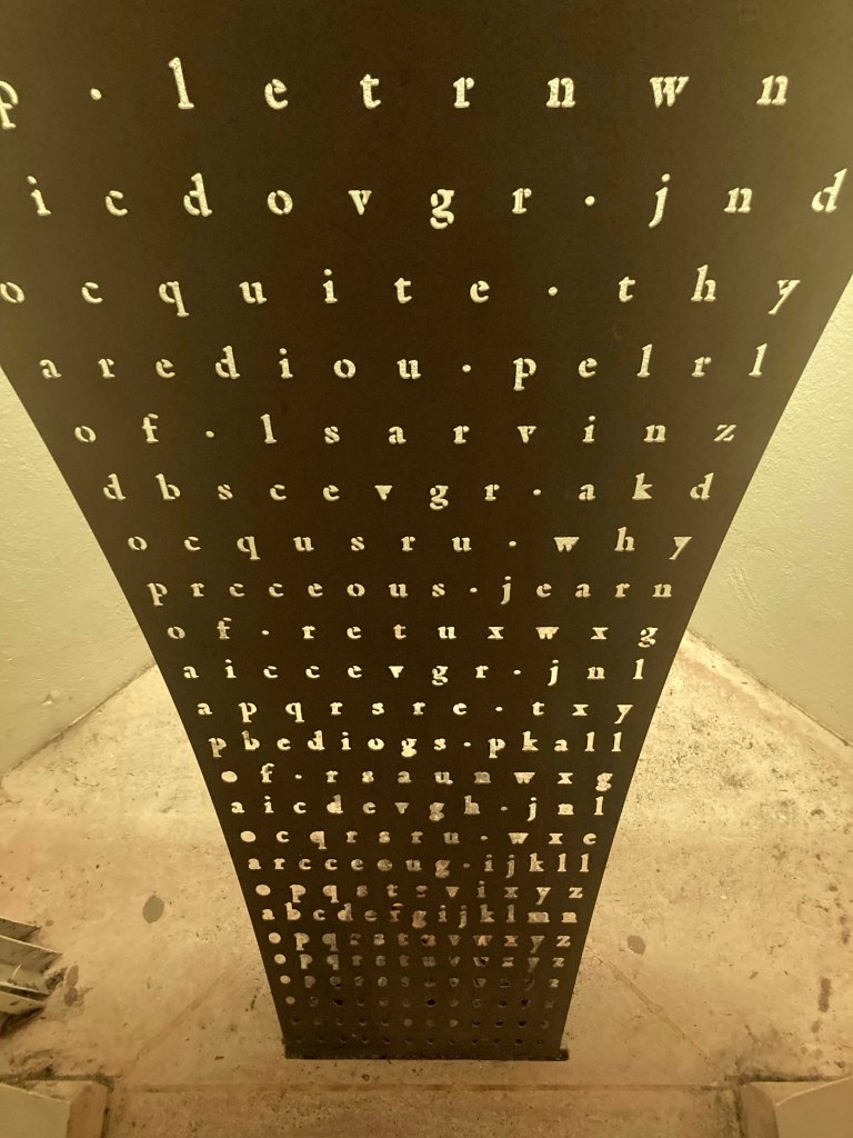
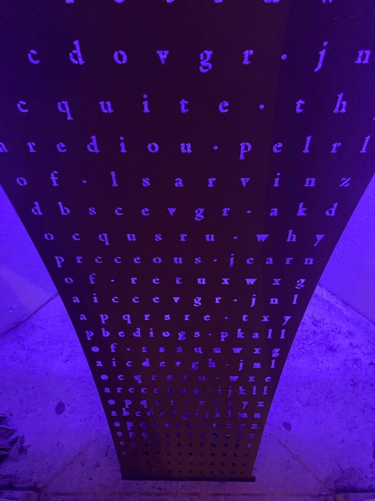
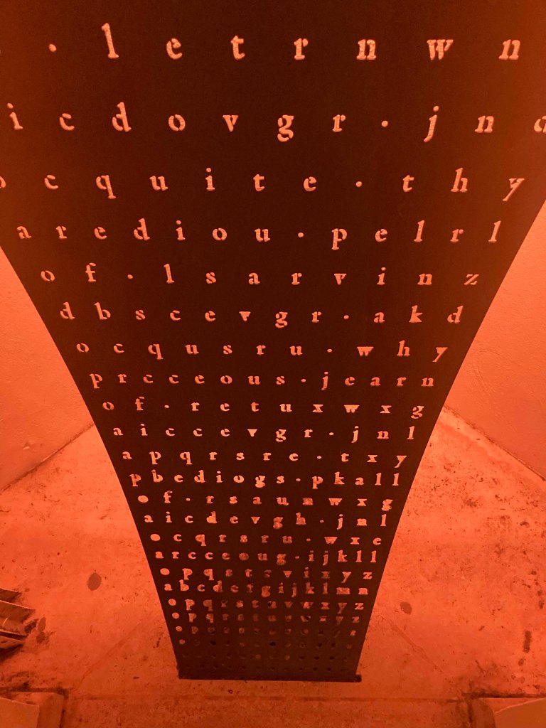
Discover and Acquire is a sculptural artwork designed for two niches in the exterior of the Forbes Mellon Library at Clare College.
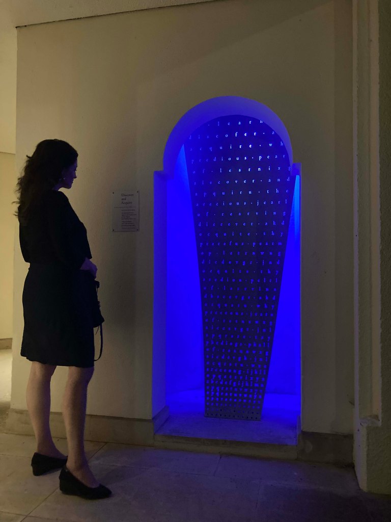
Two curved stainless-steel screens carry a pattern of laser-pierced letterforms which gradually resolve into texts from the College Statutes, given by Lady Elizabeth of Clare in 1359. These are back-lit at night in a sequence of colours.
The pierced alphabet begins at ground level with empty holes that form into letters, then words, and finally into sentences as the viewer reads up the artwork.
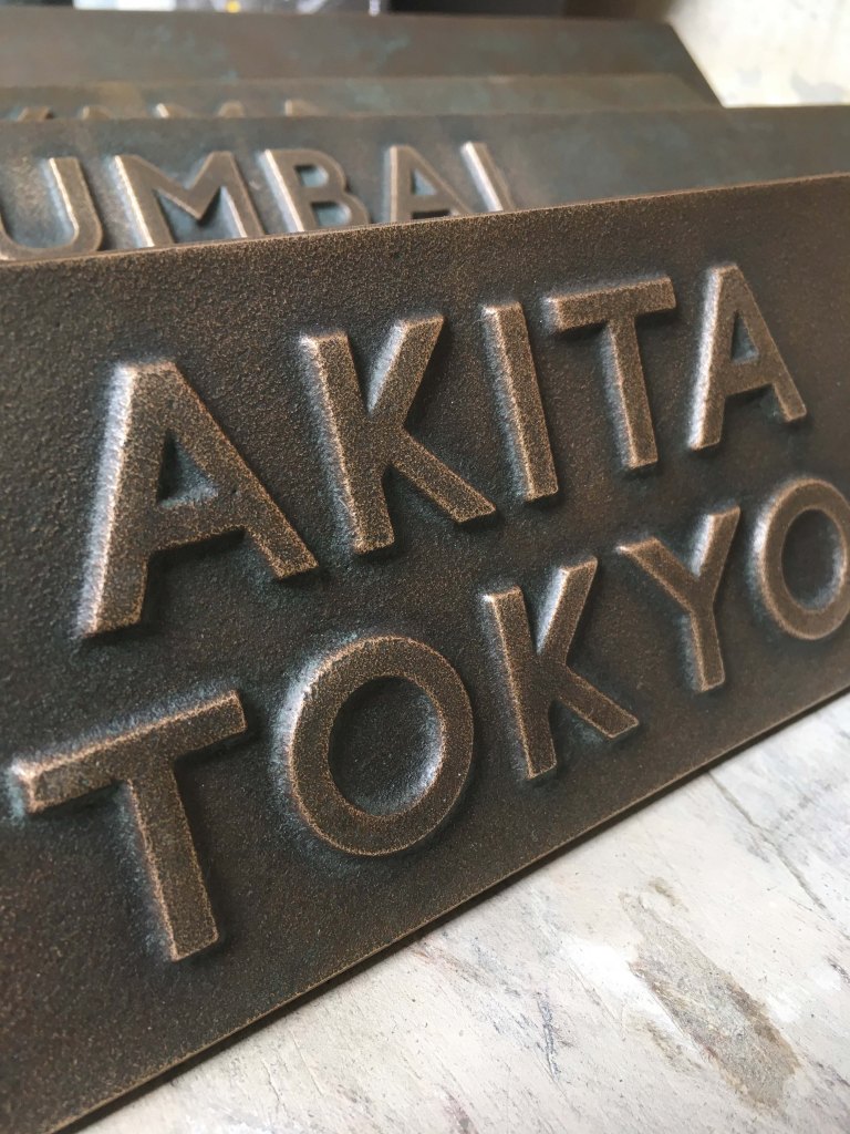
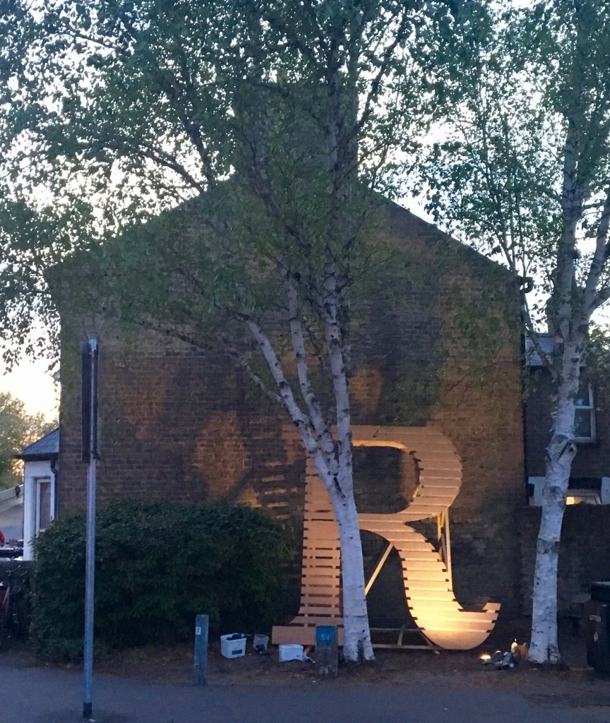
The Romsey R 2018
The Romsey R is a public artwork which celebrates the railway heritage of the part of Cambridge known as Romsey Town.
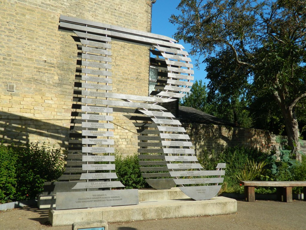
The sculptural ‘R’ is a Clarendon letter derived from a rubbing of a nearby Victorian street sign. Within this shape, bronze ‘sleepers’ list the departure-points and destinations of railway journeys that have been important in the lives of local residents of all ages. These range from the local to the international, and show the diversity of geographical background characteristic of the Romsey district.
The station names are cast in a custom font that I designed for the project and named ‘Romsey Railway’.
Pairing 2024
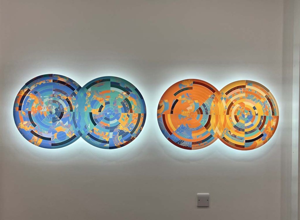
Following our collaboration on the graphic identity for the biotech company Camena, we were invited to propose an installation for the foyer to their lab. Harry had liked some recent experiments of mine and saw a way in which these could incorporate the colour-scheme of the logo within a wall-mounted illuminated relief, which was then fabricated by FSC Signs of Norwich.
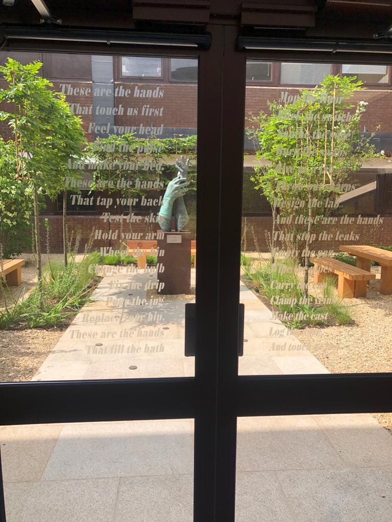
Covid Recovery Garden, St Peter’s Hospital, Woking 2023
This typographic setting of Michael Rosen’s poem Hands was applied to the glass doors opening onto Harry’s sculpture in the The Queen Elizabeth II Staff Covid Recovery Garden, at St Peter’s Hospital, Woking.The font is a specially adapted variant of my ‘Hyacinthe’
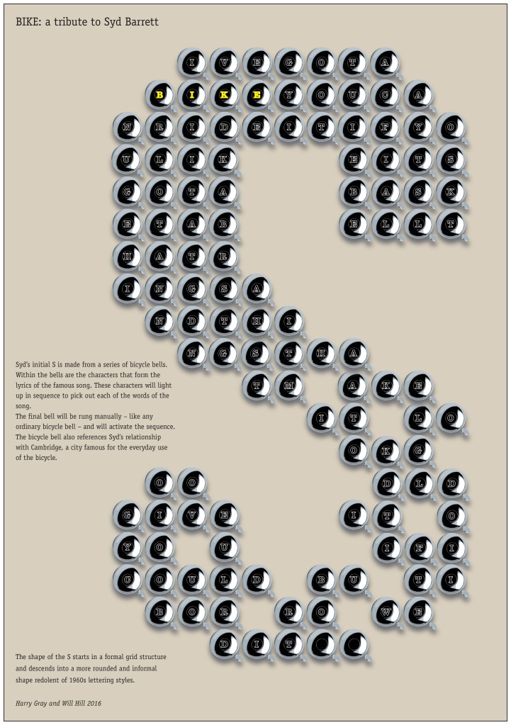
Proposal: Syd
In 2015 in response to a call from Cambridge Live we developed a proposal for a public art commission in tribute to Pink Floyd founding-member Syd Barrett, to be permanently displayed at the Cambridge Corn Exchange. The installation is based on Syd’s initial, composed from an arrangement of bicycle bells, at the centre of which are letters which will light up in sequence to form the lyrics of Syd’s famous song ‘Bike’.
Proposal: Addenbrooke’s Critical Care Unit
Submitted in response to a Cambridge University Hospitals Arts commission brief for the Neurosciences Critical Care Unit Ward at Addenbrooke’s.
“The proposed artwork takes inspiration from the comments of a former patient recorded in the consultative process. It also draws upon my own experience of the neurological services at Addenbrookes, where I was treated after suffering a stroke in April 2023′
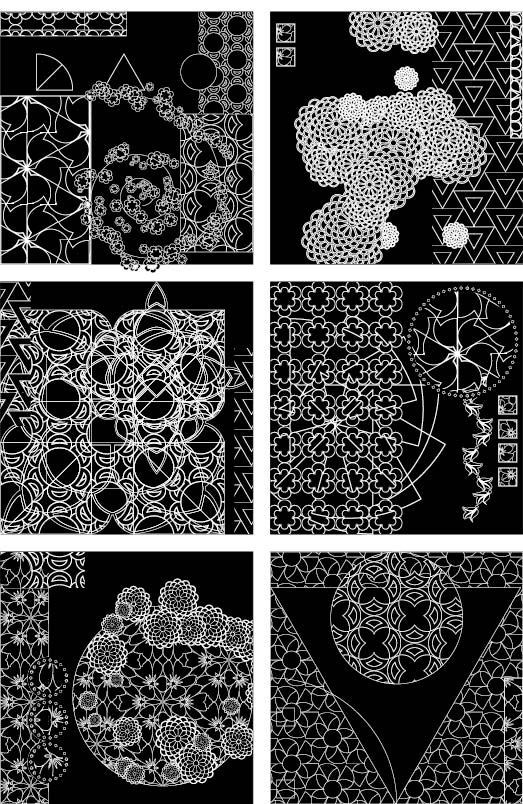
The proposal was for a set of laser-engraved illuminated back-lit panels to be arranged in different grid configurations according to the dimensions of the wall-spaces, to form a visual continuum linking the different zones of the ward.
‘Each panel will be engraved in highly detailed patterns designed to engage the eye and stimulate the cognitive capacity of patients in recovery, while providing the calming effect of symmetry and order.
‘Beginning from fundamental shapes such as circle, triangle, square, (the first shapes we give names to as children) the proposed designs will progress through divisions, permutations and multiples of these shapes to create complex repeat patterns which in turn evoke organic forms and seasonal cycles. The work as a whole will use themes of repetition and transformation to represent the journey to recovery, from regaining the fundamentals of cognition to fully restoring the capacity for creativity, complex thought, and the enjoyment of decorative forms.
The elements of the design will work together to form a journey that can be read in multiple directions: tracing patterns and making connections ‘forward’ as on a timeline from the event into the future, while travelling ‘back’ from a critical neurological event to recovery.’
