Since completing my Masters in Typeface Design at the University of Reading in 2006 I have continued to explore ideas in font design. Most of these are speculative or experimental projects rather than fully-realised releases.
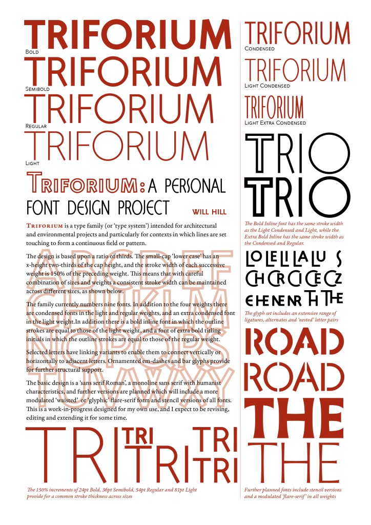
Triforium
Triforium is a type family (or ‘type system’) intended for architectural and environmental projects and particularly for contexts in which lines are set touching, to form a continuous field or pattern. The basic design is a ‘sans serif Roman’, a monoline sans serif with humanist characteristics.
The design is based upon a ratio of thirds. The small-cap ‘lower case’ has an x-height two-thirds of the cap height, and the stroke width of each successive weight is 150% of the preceding weight. This means that with careful combination of sizes and weights a consistent stroke width can be maintained across different sizes, as shown below.
The family currently numbers nine fonts. In addition to the four weights there are condensed fonts in the light and regular weights, and an extra condensed font in the light weight. In addition there is a bold inline font in which the outline strokes are equal to those of the light weight, and a font of extra bold titling initials in which the outline strokes are equal to those of the regular weight.
Selected letters have linking variants to enable them to connect vertically or horizontally to adjacent letters. Ornamented em-dashes and bar glyphs provide for further structural support.
Further versions are planned which will include a more modulated ‘waisted’ or ‘glyphic’ flare-serif form and stencil versions of all weights and widths. This is a work-in-progress designed for my own use, and I expect to be revising, editing and extending it for some time.
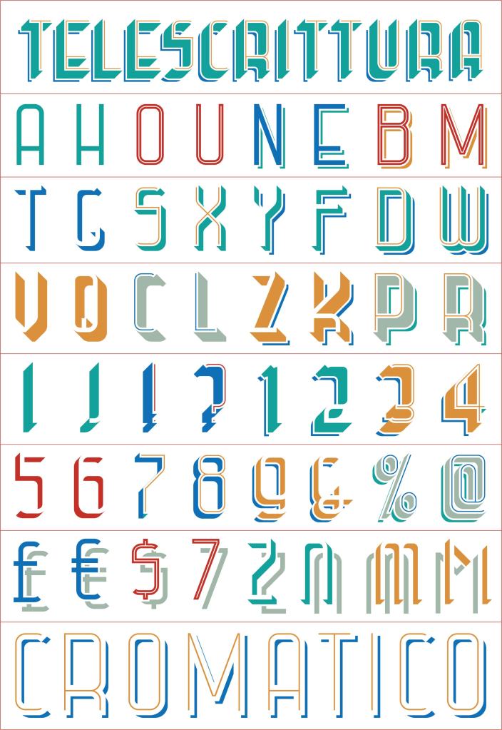
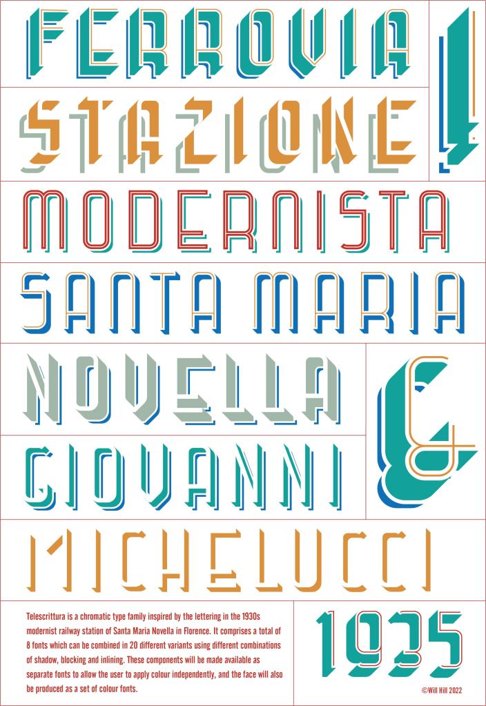
Telescrittura
In 2022 I travelled to Florence for the first time in 50 years. The city is rich in examples of renaissance lettering which I might have expected to inspire new typographic projects, but in fact the letters that caught my imagination date from the 1930s and the modernist architecture of the Santa Maria Novella railway station. Noticing these in the last minutes before our train left the station, I refrained from photographing the letters and instead resolved to commit their defining features to memory.
The word ‘Telescrittura’ appears by the doorway of some offices that open onto the platform. The word seems to have vanished from use, and my guess is that it refers to a teleprinter or similar mid-century technology.
The dimensional blocking was inspired by the much larger arcihtectural letters that overlook the main concourse.
The resulting design is a chromatic type family. It comprises a total of 8 fonts which can be combined in 20 different variants using different permutations of shadow, blocking and inlining. These components will be made available as separate fonts to allow the user to apply colour independently, and the typeface will also be produced as a set of colour fonts.
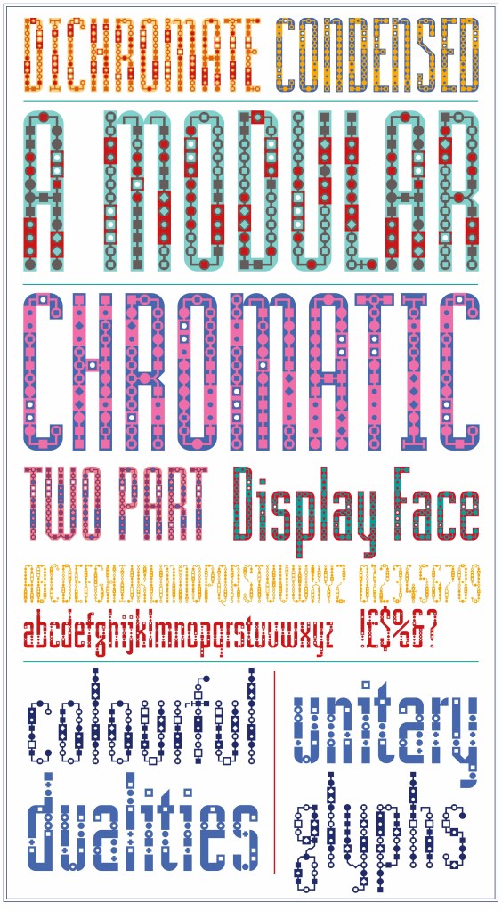
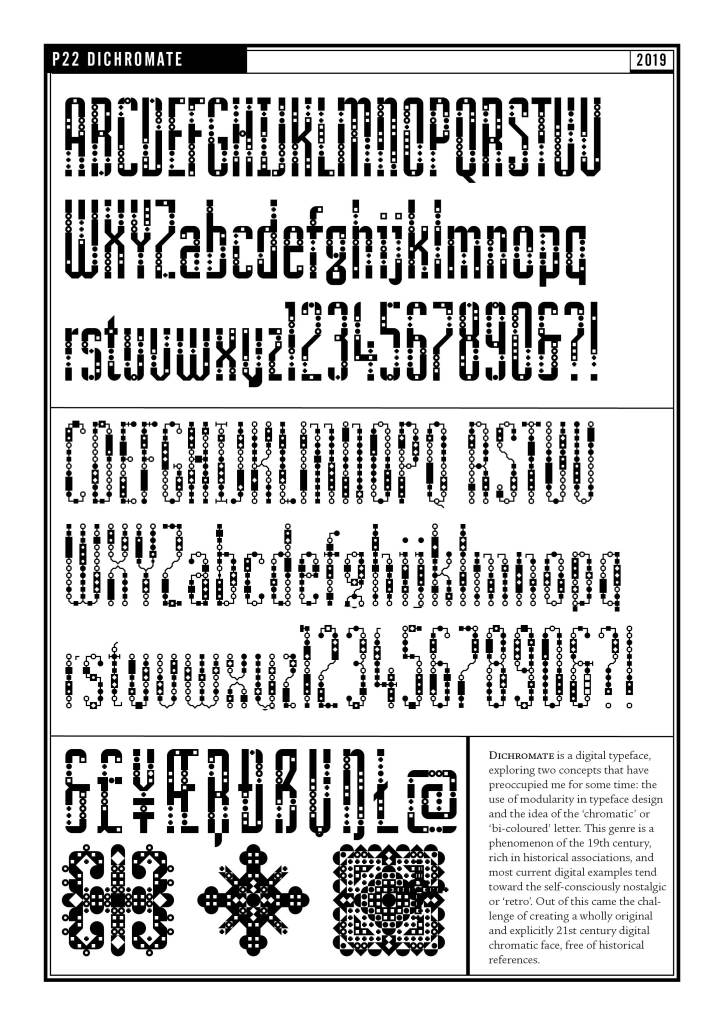
Dichromate
Dichromate is a typeface designed to explore two concepts that have preoccupied me for some time: the use of modularity in typeface design and the idea of the ‘chromatic’ or ‘bi-coloured’ letter. This genre is a phenomenon of the 19th century, rich in historical associations, and most current digital examples tend toward the self-consciously nostalgic or ‘retro’. Out of this came the challenge of creating a wholly original and explicitly 21st century digital chromatic face, free of historical references.
The typeface was released in 2020 by the US foundry P22 as P22 Dichromate.
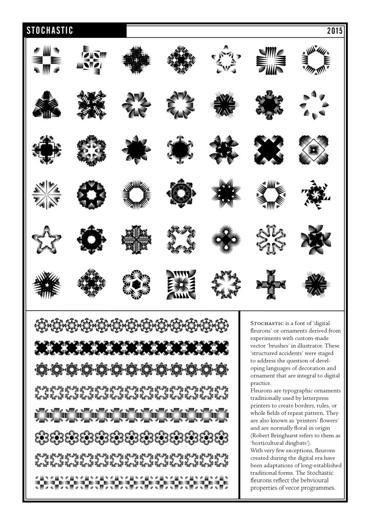
Stochastic
Stochastic is a font of ‘digital fleurons’ or ornaments derived from experiments with custom-made vector ‘brushes’ in illustrator, which led me to some serendipitous accidents. It occurred to me that these ‘structured accidents’ might be developed to address a question that has preoccupied me for some time: the problem of developing languages of decoration and ornament that are integral to digital practice,
Fleurons are typographic ornaments traditionally used by letterpress printers to create borders, rules, paragraph breaks or whole fields of repeat pattern. They are also known as ‘printers’ flowers’ and are normally floral in origin (the writer Robert Bringhurst refers to them as ‘horticultural dingbats’). With very few exceptions, fleurons created during the digital era have simply been adaptations of long-established traditional forms.
Stochastic was included in David Jury’s Little Book of Typographic Ornament (Laurence King, London 2015)
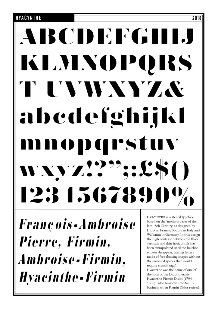
Hyacinthe
Working on site-specific projects with the sculptor Harry Gray revived an interest in the design of stencil typefaces, in which all the counterforms within the letters were ‘self-supporting’. Rather than resorting to the linking tags that support or anchor the counterforms in more traditional stencil faces, I looked for an approach in which the linkage was integral to the form of the letter. Taking as a starting point the ‘modern’ faces of the late 18th Century, as designed by Didot in France, Bodoni in Italy and Walbaum in Germany, and further extrapolated from the high contrast between the thick vertical and thin hotizontals until the hairline strokes disappeared completely, to leave letters made of free-floating shapes without enclosed spaces.
I later used the typeface in the prints that comprise the Kite Series (link) and also created an emboldened version for the setting of Michael Rosen’s Poem ‘Hands’ for …(details from Harry link)
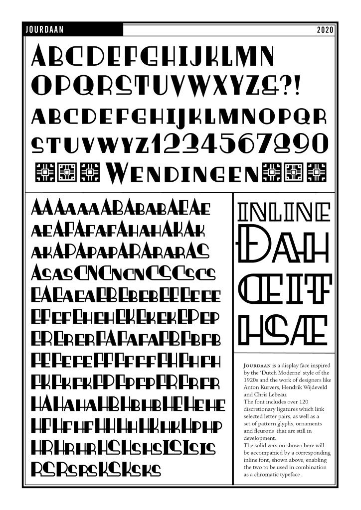
Jordaan
Jourdaan is a display face based in the ‘Dutch Moderne’ style of the 1920s and the work of designers lincluding Anton Kurvers, Hendrik Wijdeveld and Chris Lebeau.
It is a ‘small cap’ face comprising a solid and an inline font, which can be used in combination as a chromatic typeface.
Both fonts include about 120 discretionary ligatures, which link selected letter pairs, as well as a rich set of pattern glyphs, ornaments and fleurons.
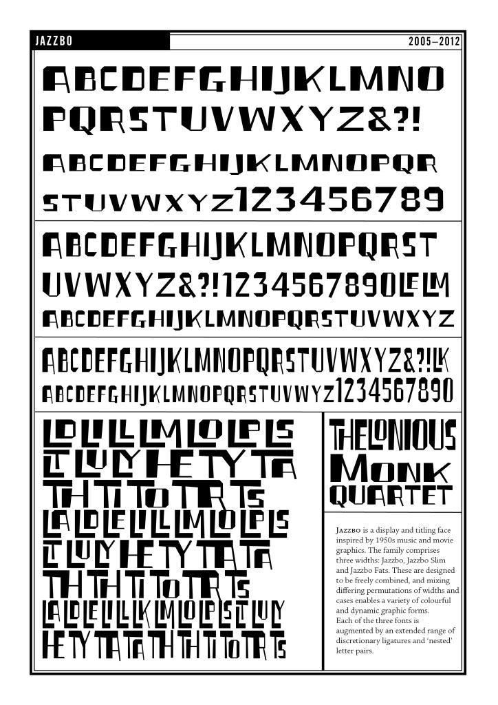
Jazzbo
For my first experiments in typeface design I wanted to work within very simple parameters and constraints, that would enable me to defer some of the more complex aspects of vector drawing, while become a defining feature of the design. In practice, I chose to do this by designing a set of letters with no curves.
My model for this face was the lettering style used by several American graphic artists in the 1950s, exemplified in some of the work of Ben Shahn, and also the way that designers like Reid Miles made creative use of the limitations of headline photosetting systems to crop letters. Both appear in many jazz album covers of the time.
Jazzbo is a display face with no lower case. The three widths – Jazzbo, Jazzbo Slim and Jazzbo Fats – can be freely mixed.
Having established a very simple style, I wanted the typeface to reveal unexpected complexities and offer a range of creative scope to the user. This took the form of an extended range of ligatured and ‘nested’ letter pairs.
In 2012 I was invited by Gunnlagur Briem to contribute a page spread to his Briem Report in which I was able to present the rationale for the type family in detail.