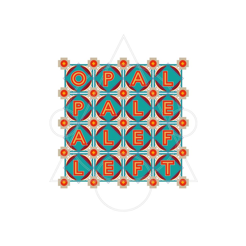
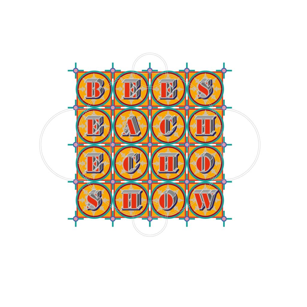
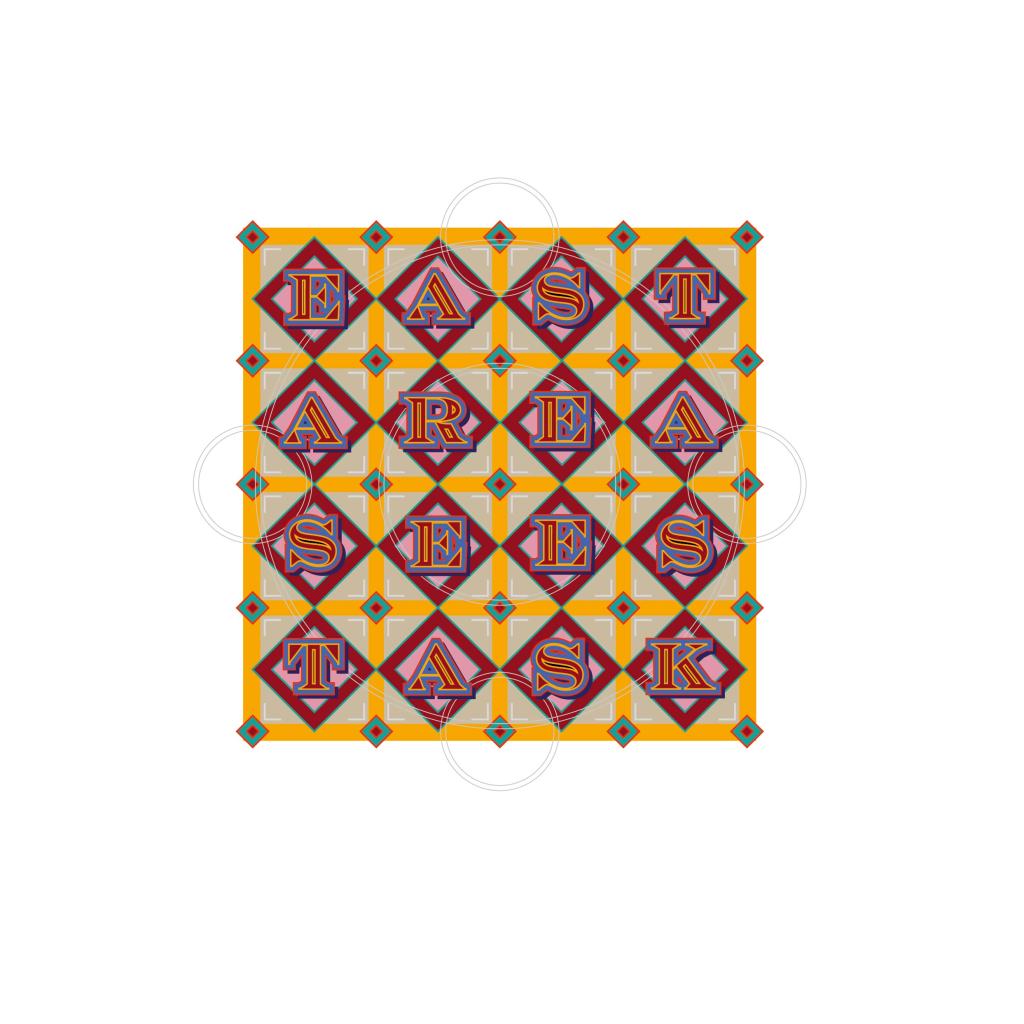
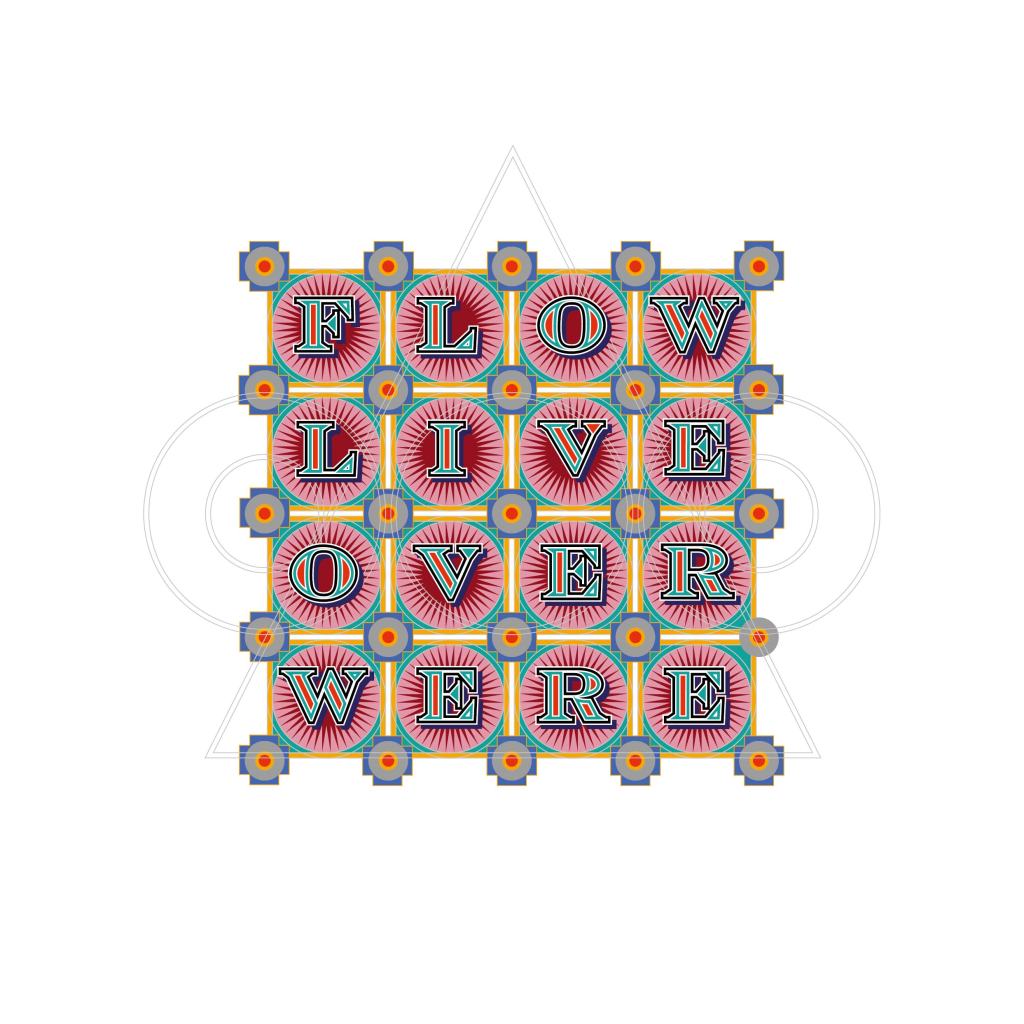
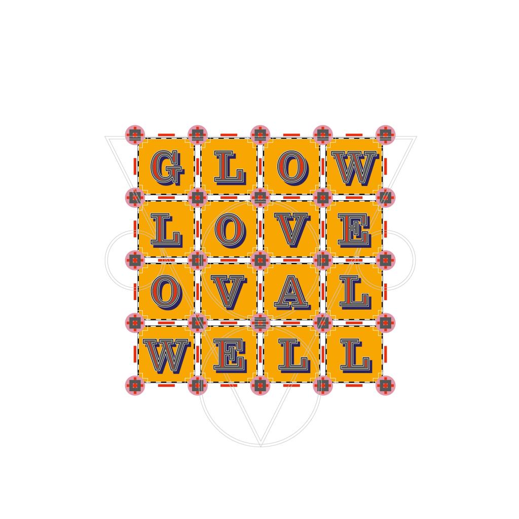
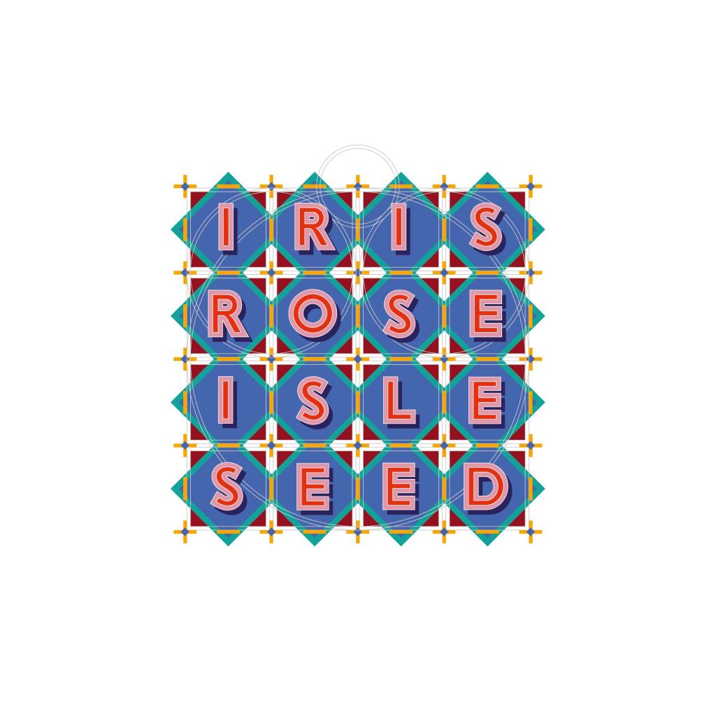
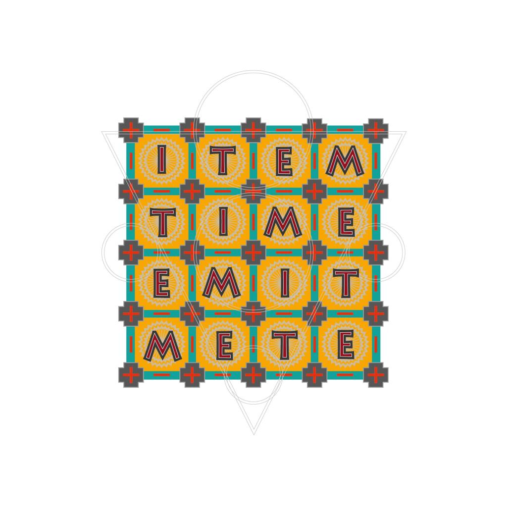
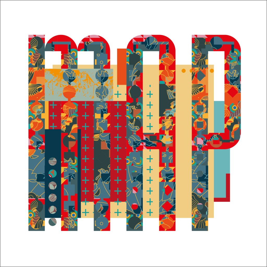
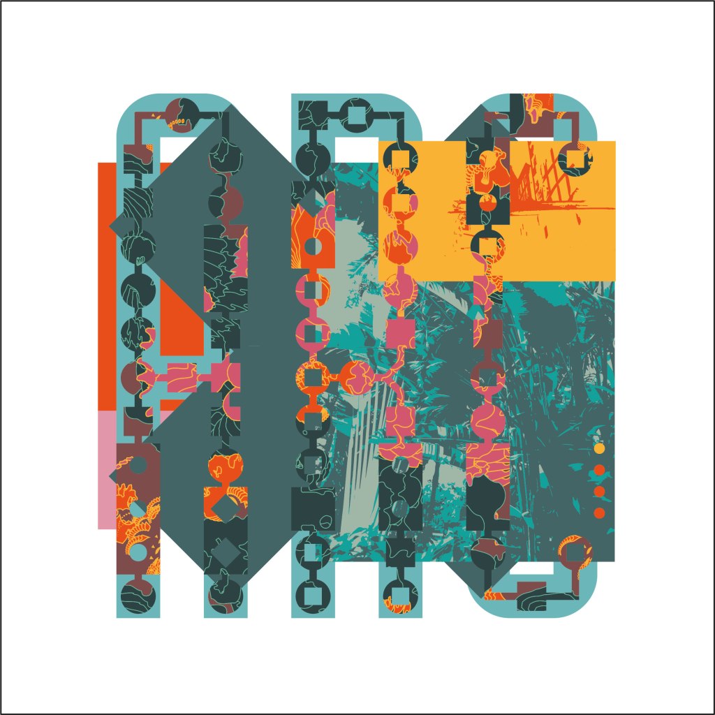
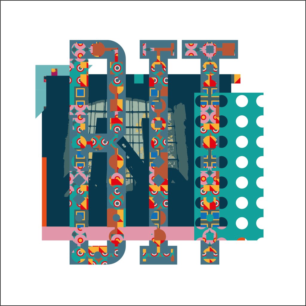
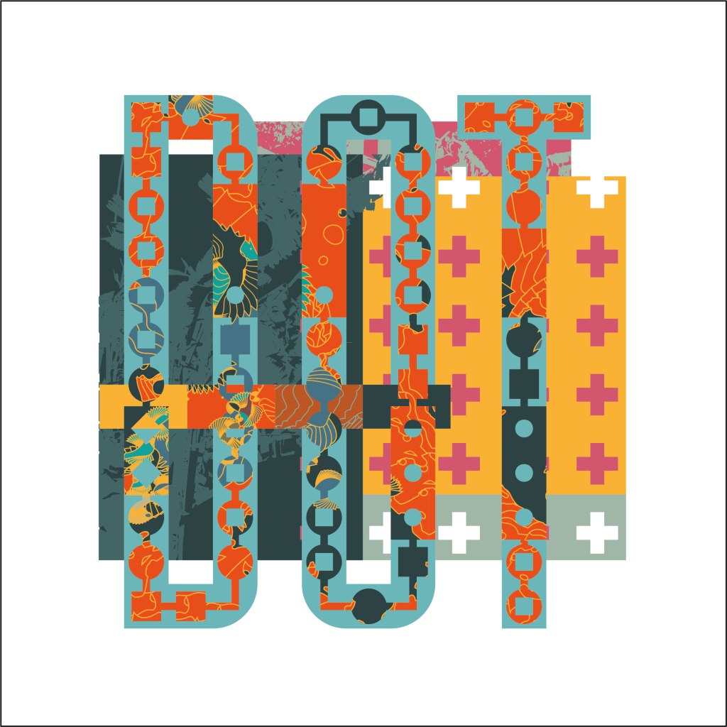
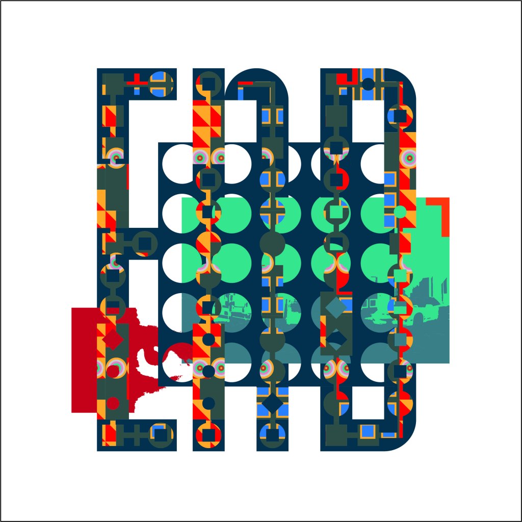
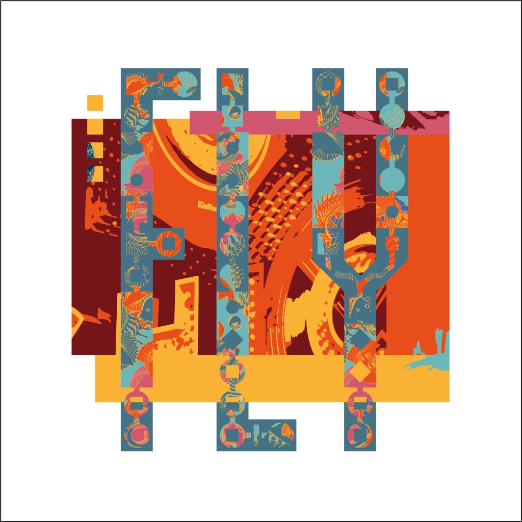
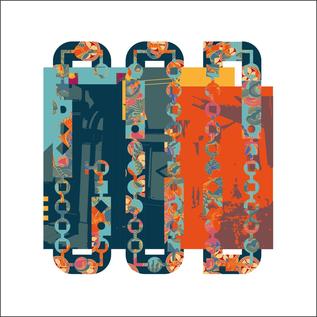
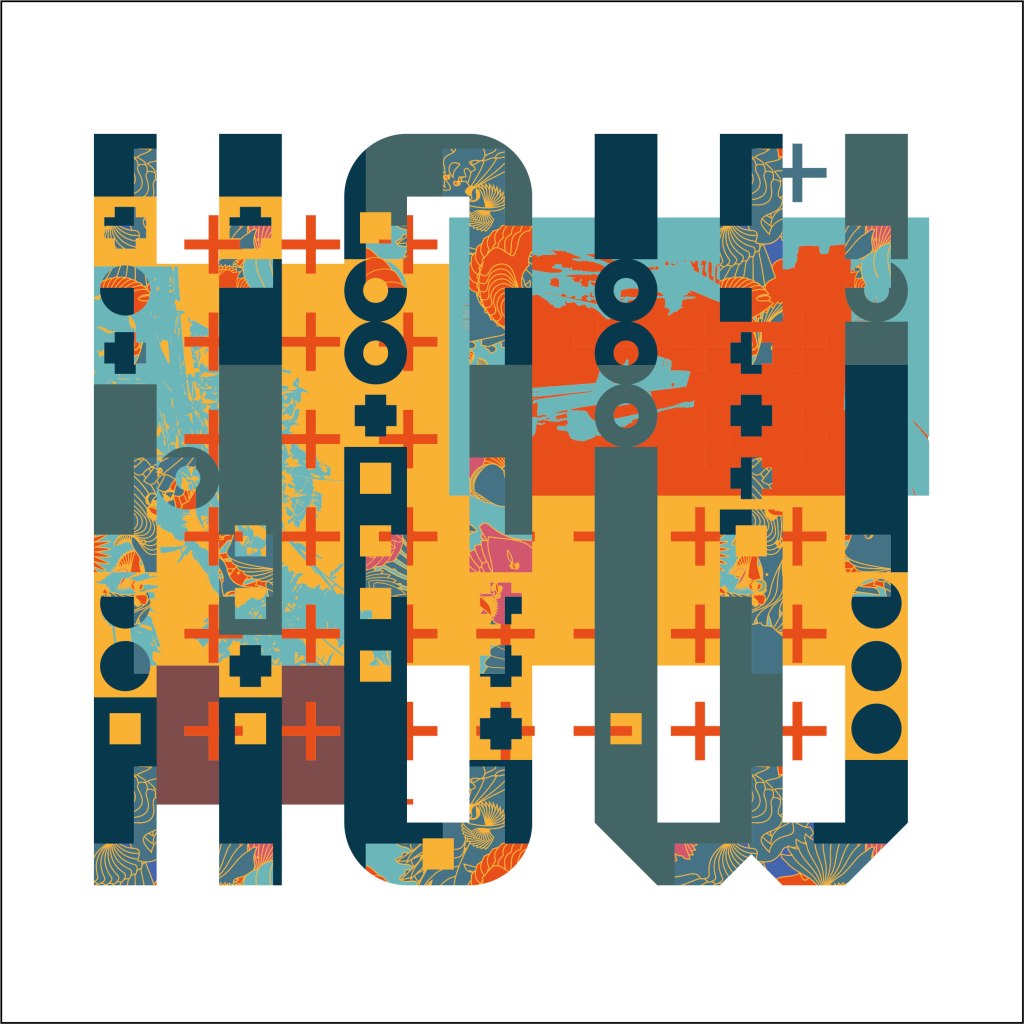
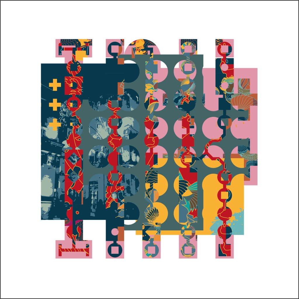
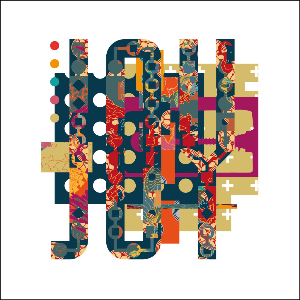
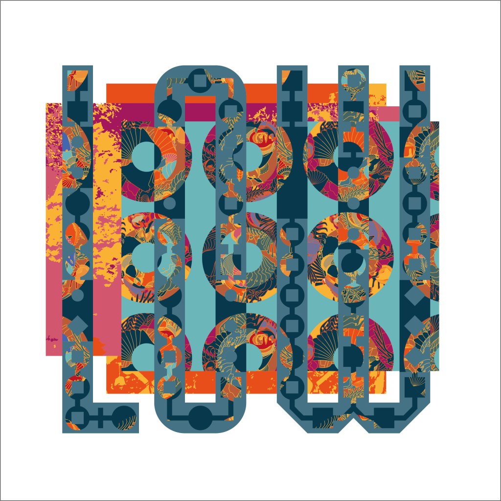
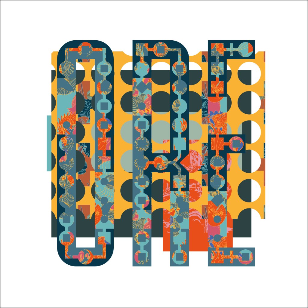
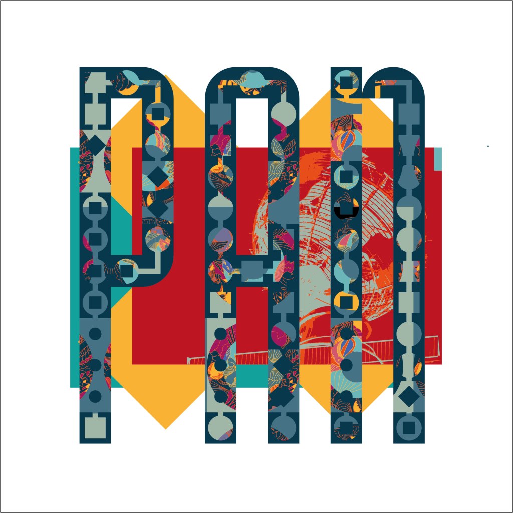
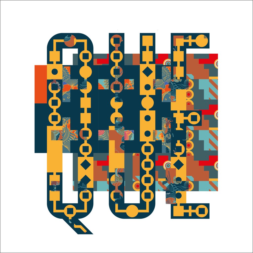
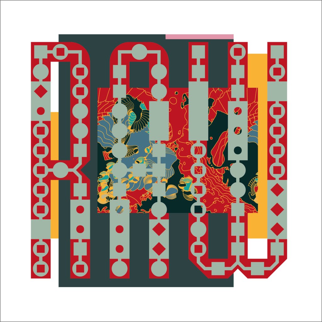
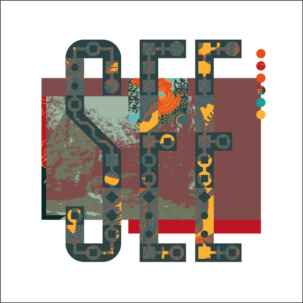
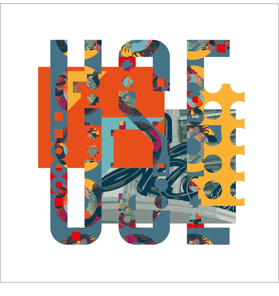
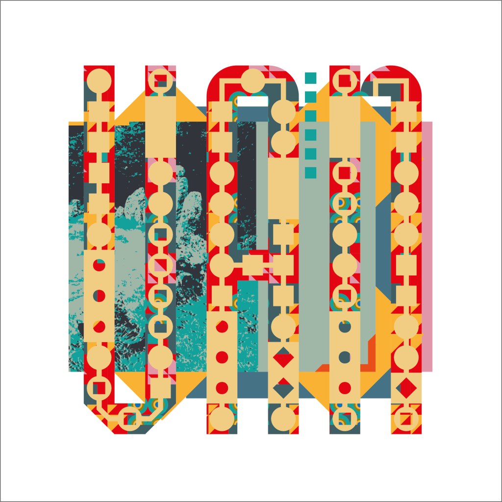
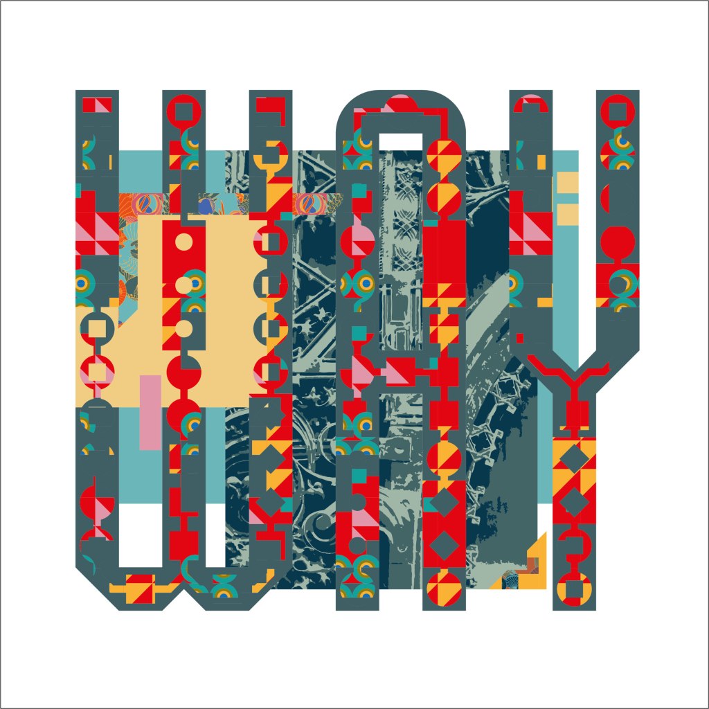
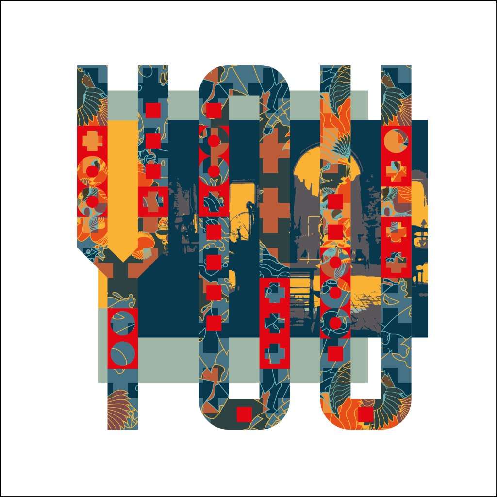
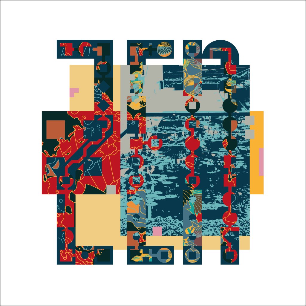
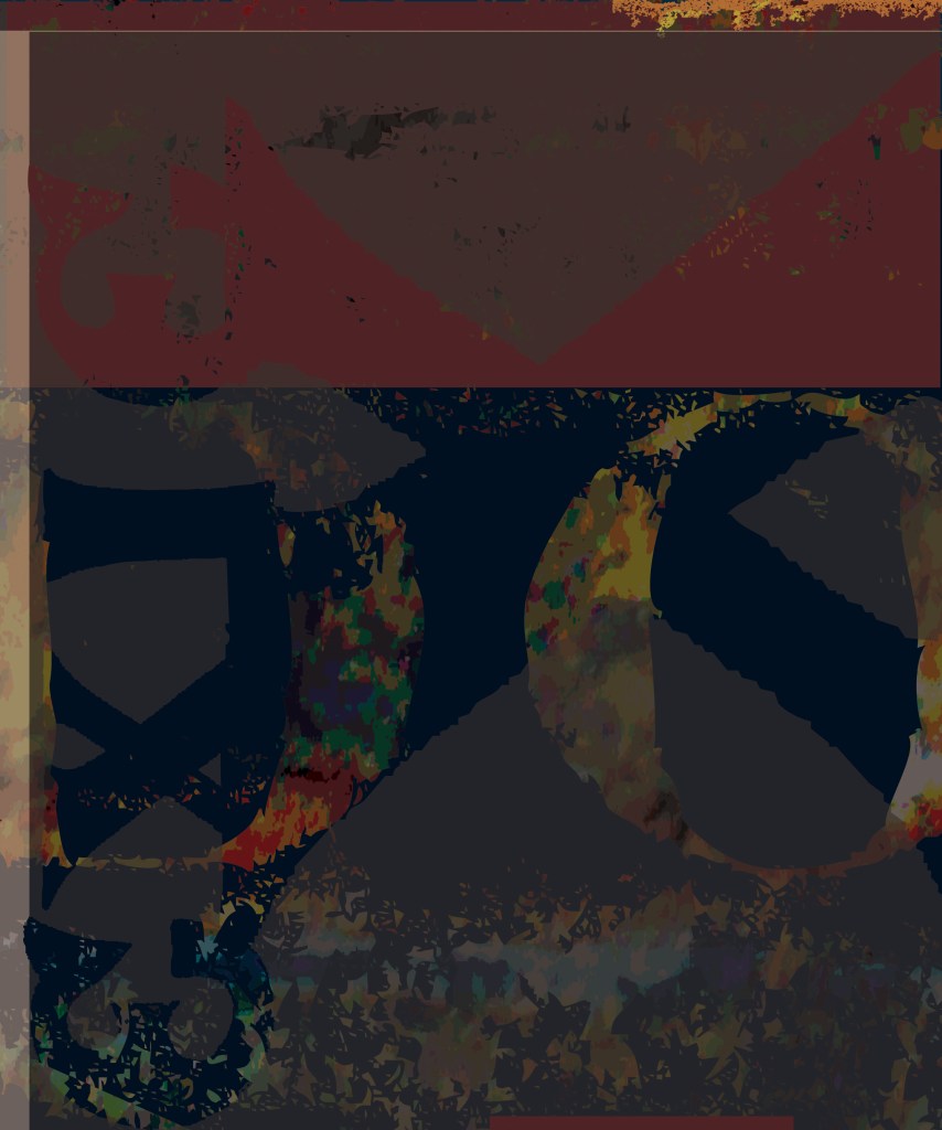
Dichromate series 2023
My experimental typeface Dichromate was published in 2019 by P22 in the United States as P22Dichromate. The two-layer ‘chromatic’ face was the subject of a case study in in the Berlin design journal Slanted. I then used the letters as a framework for a series of visual improvisations that test the possibilities of a two layer letterform as a vessel for explorations of colour and pattern over an alphabetical sequence of three-letter words.
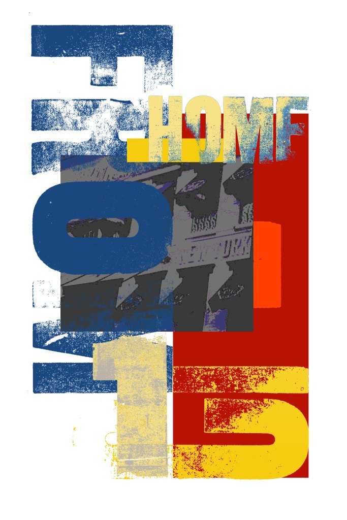
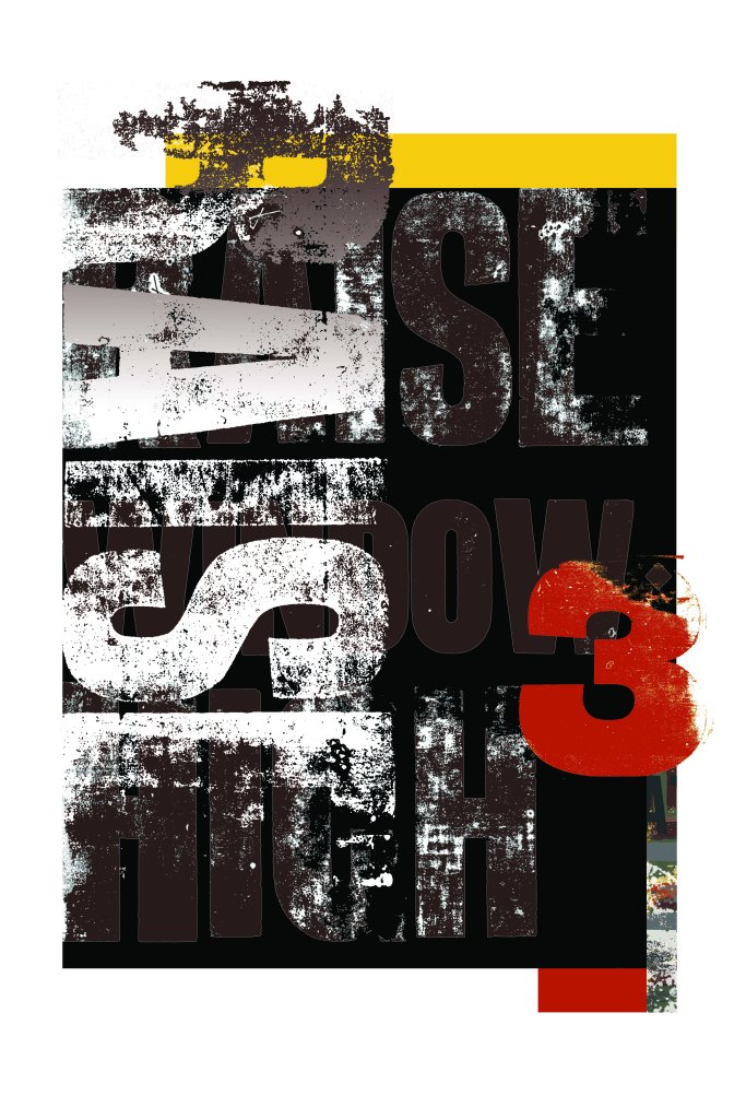
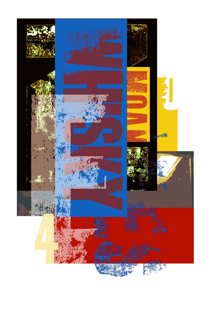
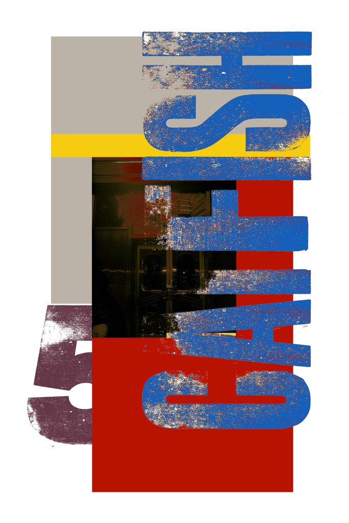
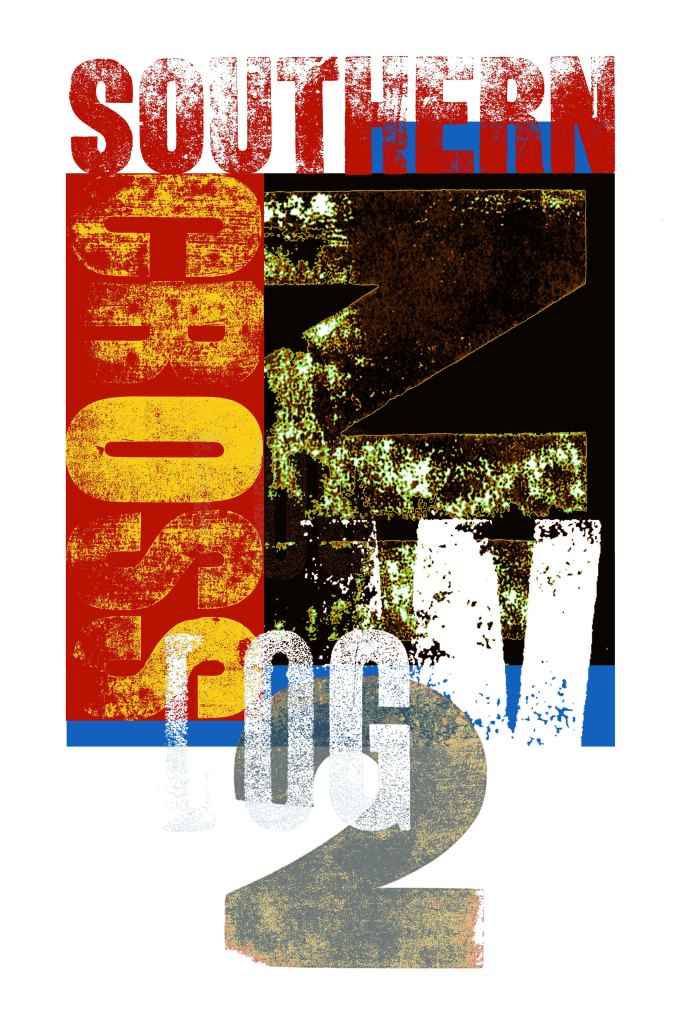
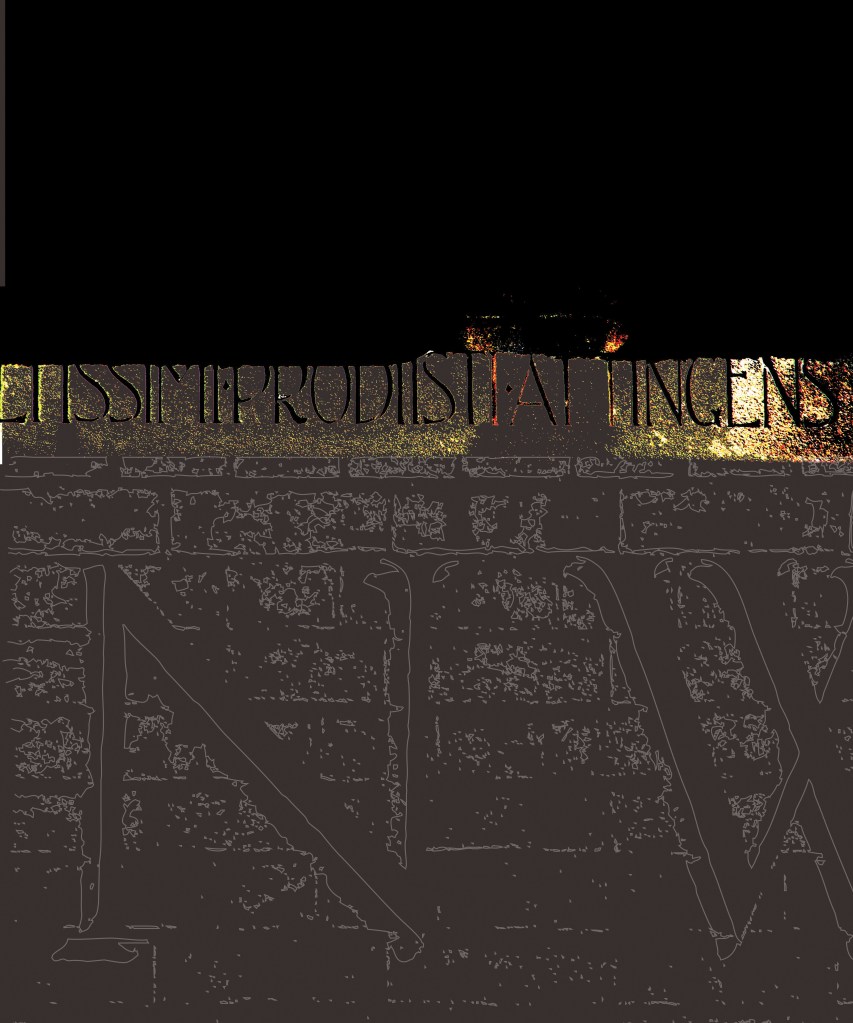
Where the Southern cross the Dog 2007
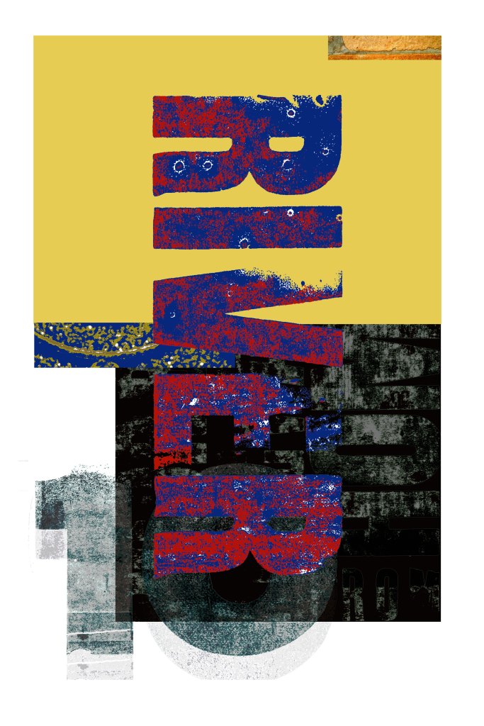
These prints take as their starting point the ‘folk-lyric’ fragments and floating verses which recur in the traditions of rural American blues lyrics from the 1920s and 1930s. These form a pool of lyric elements which were then drawn upon and recombined by blues musicians up to this day
Much like these verses, wooden display or poster letters are part of a folk vernacular, often of uncertain attribution and classified in broad generic terms rather than by specific authorship. As a dominant typographic medium during the period from the late nineteenth century through to the 1930s, these types are concurrent with the music which this project takes as its inspiration.
Wood types also carry the record of a physical history; frequently chipped or worn, losing definition through accretions of ink or the erosion of frequent use, they have a tactile resonance which echoes the project’s source material.
These prints are produced using types from the letterpress workshops at Cambridge School of Art. Previously one of the key regional centres of the printing trade, the School has retained a substantial stock of metal and wood types
The title alludes to the verse ‘Goin’ where the Southern cross the Dog’, recounted by John Handy in the 1890’s and generally recognised as the first transcribed instance of a traditional blues lyric.
A selection from this series was later reproduced in the book Handmade Graphics by Anna Wray: Rotovision 2009
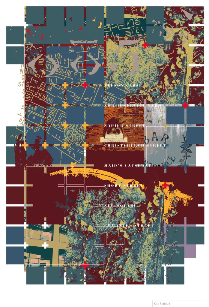
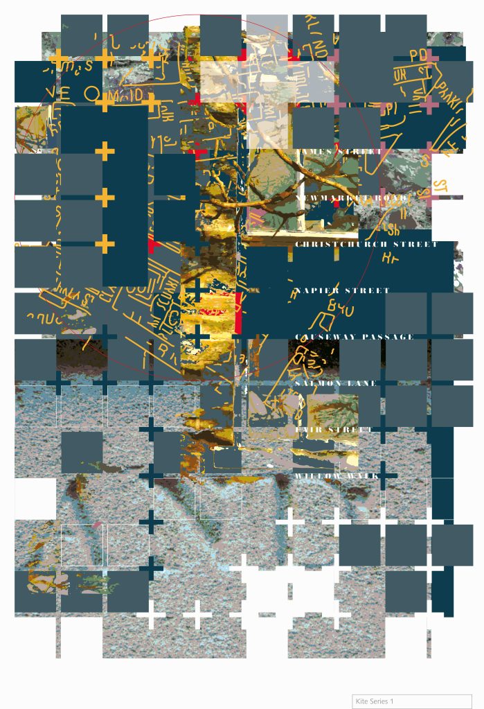
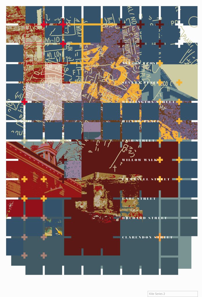
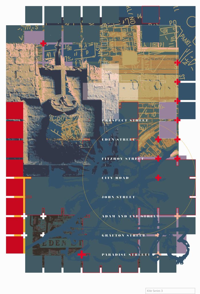
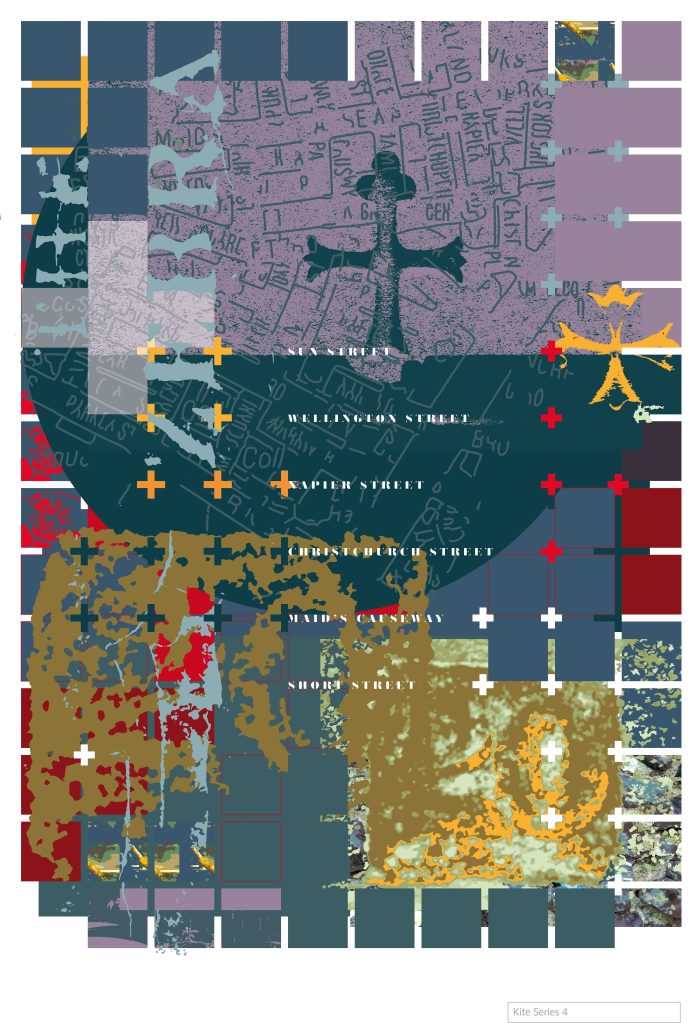
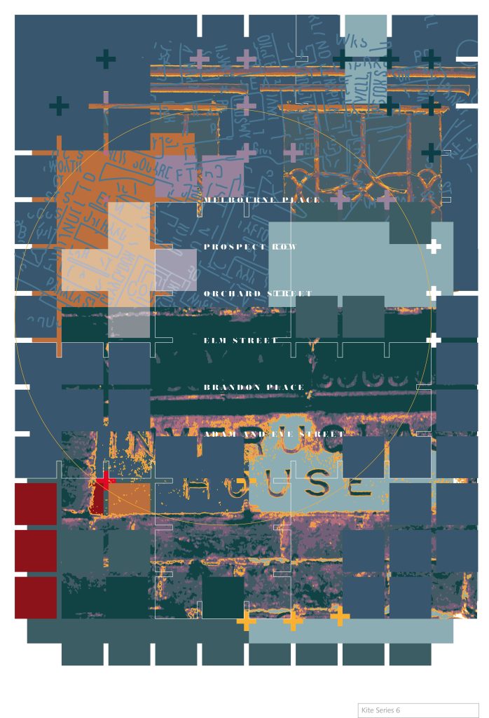
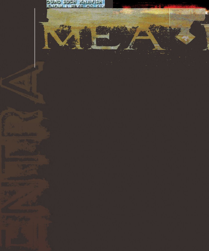
The Kite series 2010
These six prints were created for the group exhibition ‘Breathing the Kite’ curated by Chris Williams, for which a small group of invited artists recalled a once vibrant quarter of 1970s Cambridge that was later lost to development.
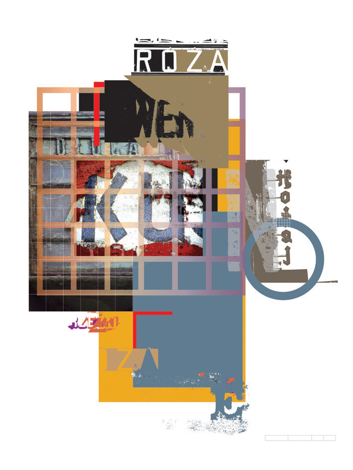
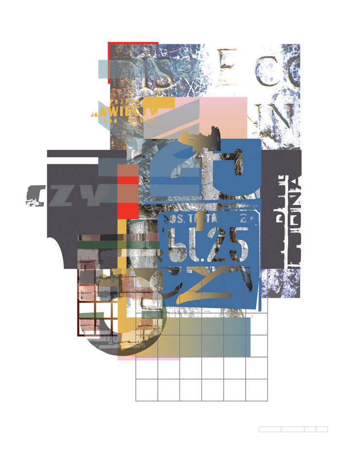
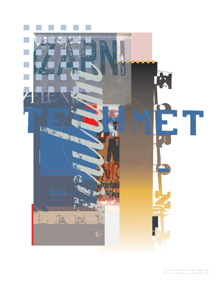
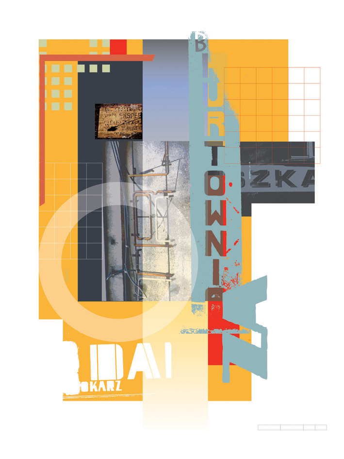
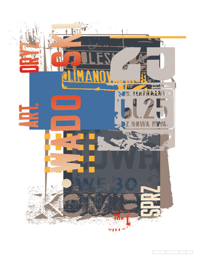
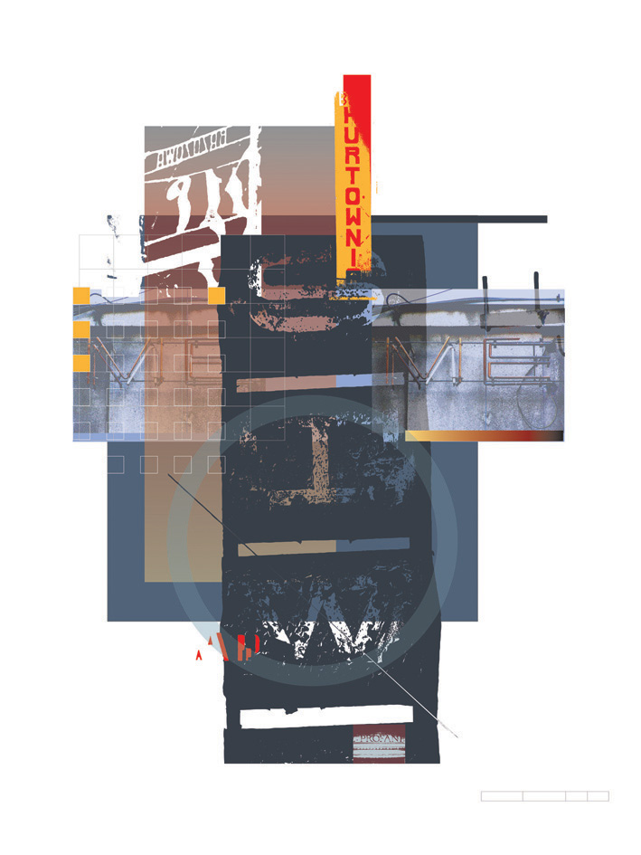
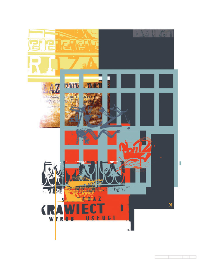
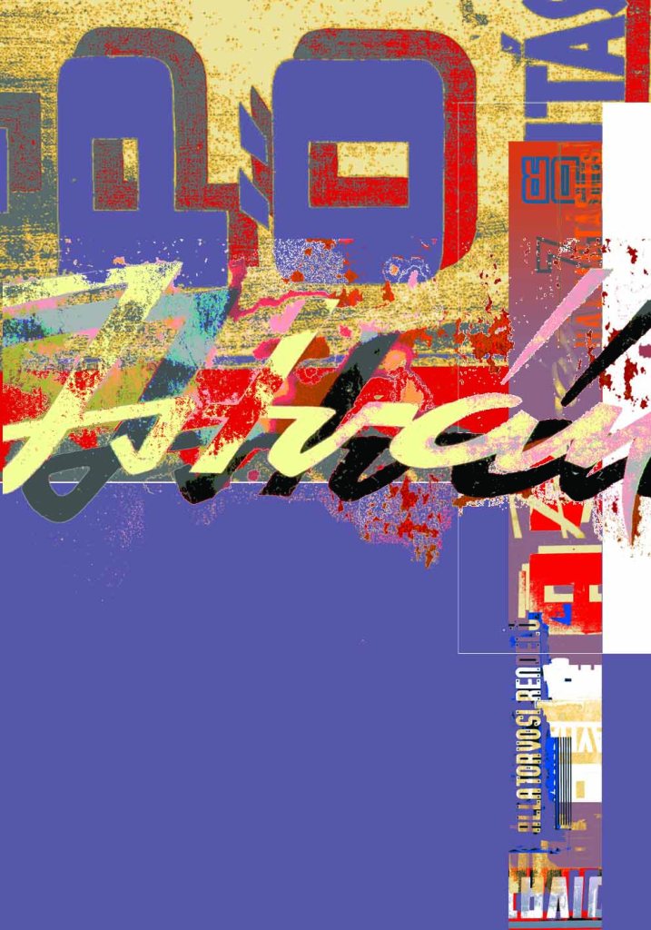
Krakow series 2009
This series, from a trip to Krakow as guest of Dr Ewa Satalecka of the Academy of Arts and Design in Katowice, was exhibited in a joint exhibition with Jim Butler as ‘Signs of Change, signs of life’, first at the Ruskin Gallery, Cambridge School of Art, and subsequently at the University of Porto, Portugal.

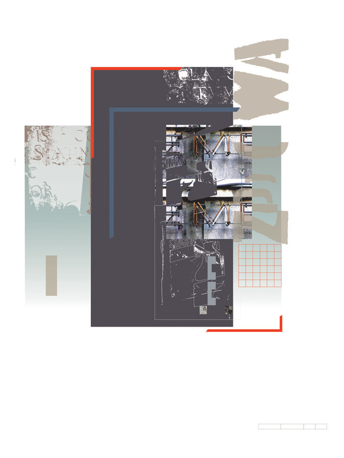
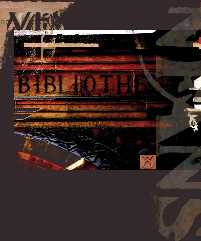
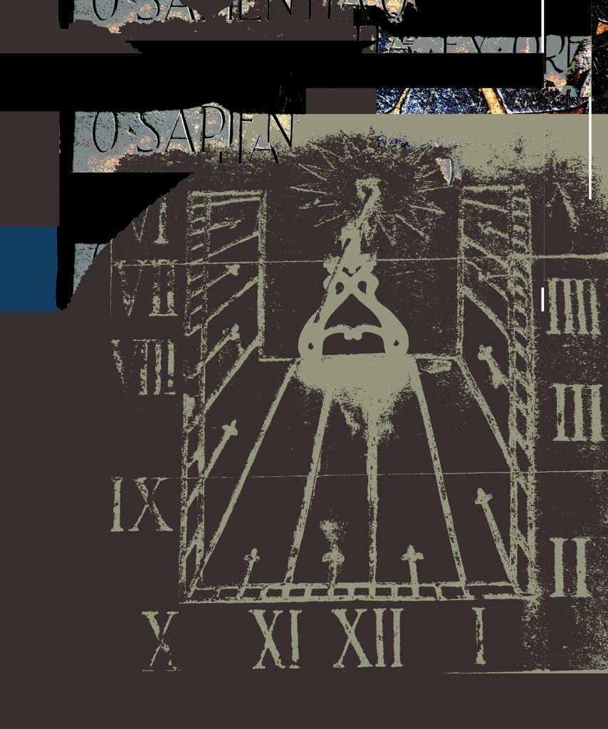
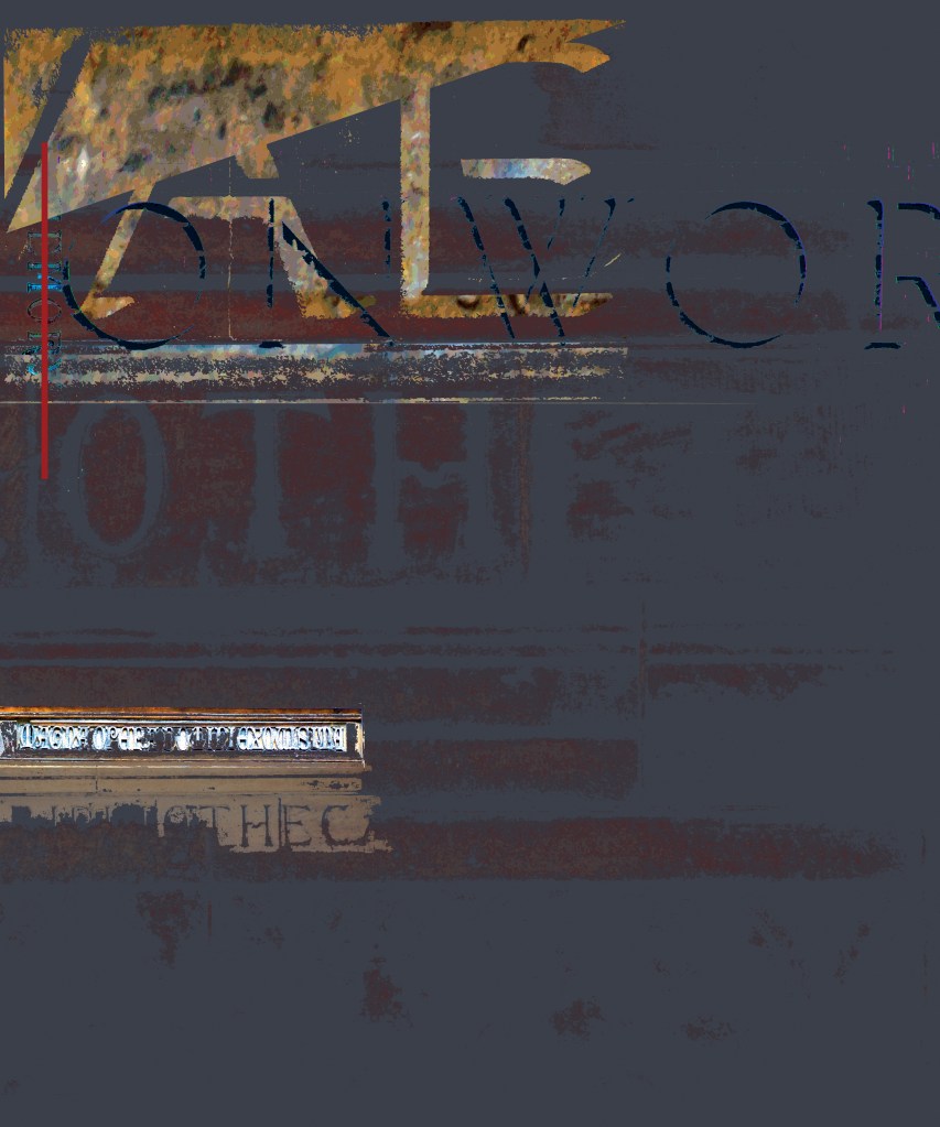
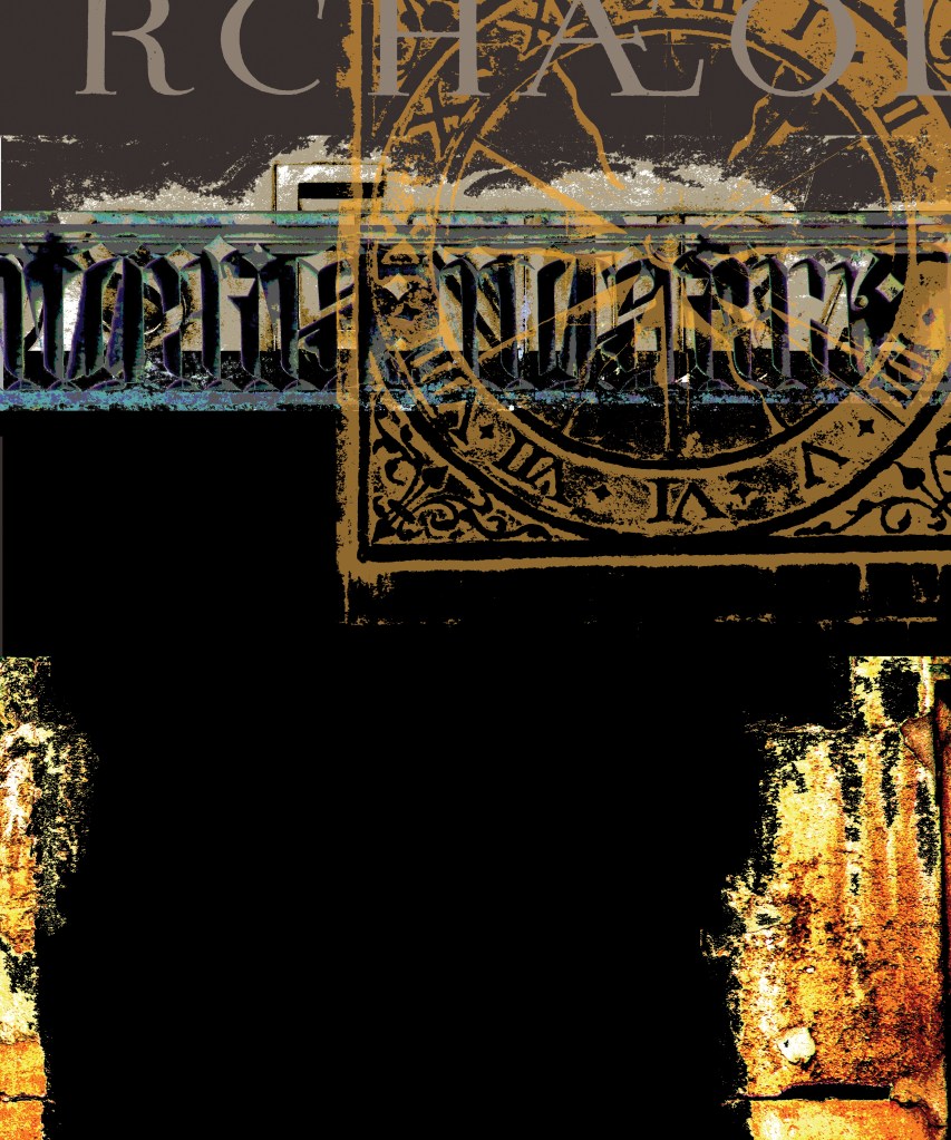
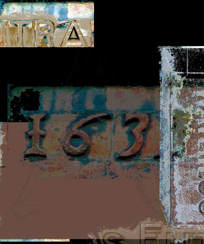
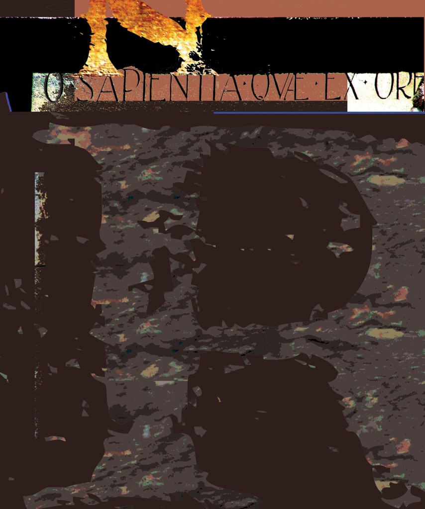
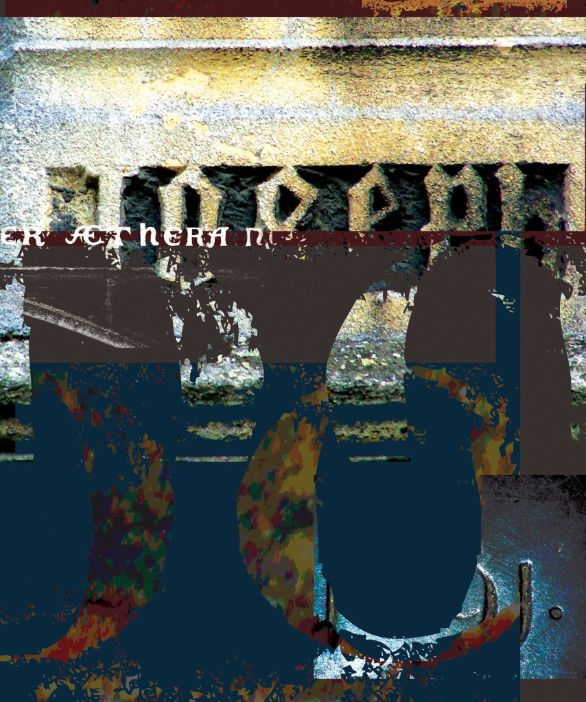
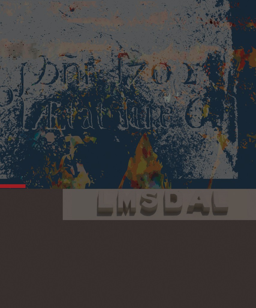
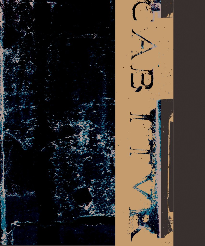
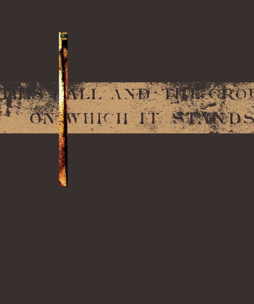
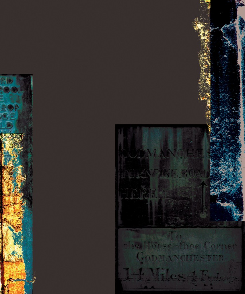
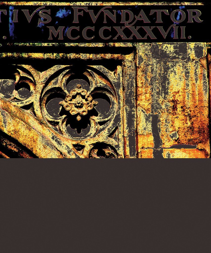
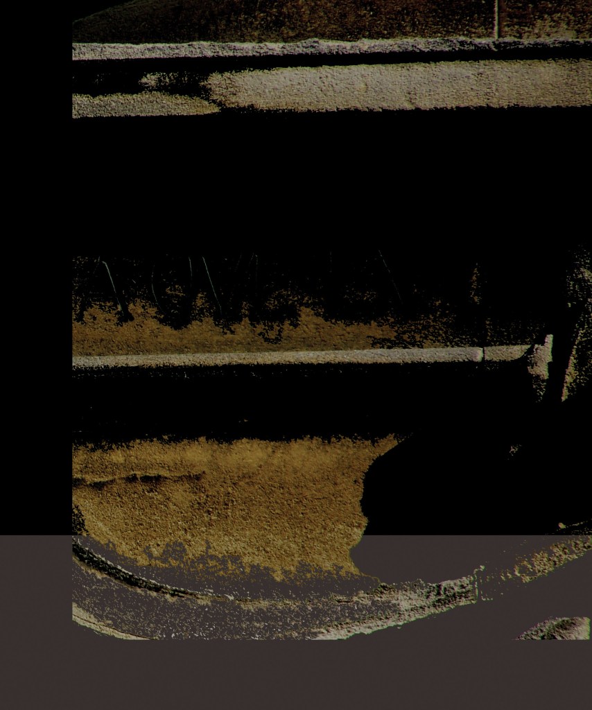
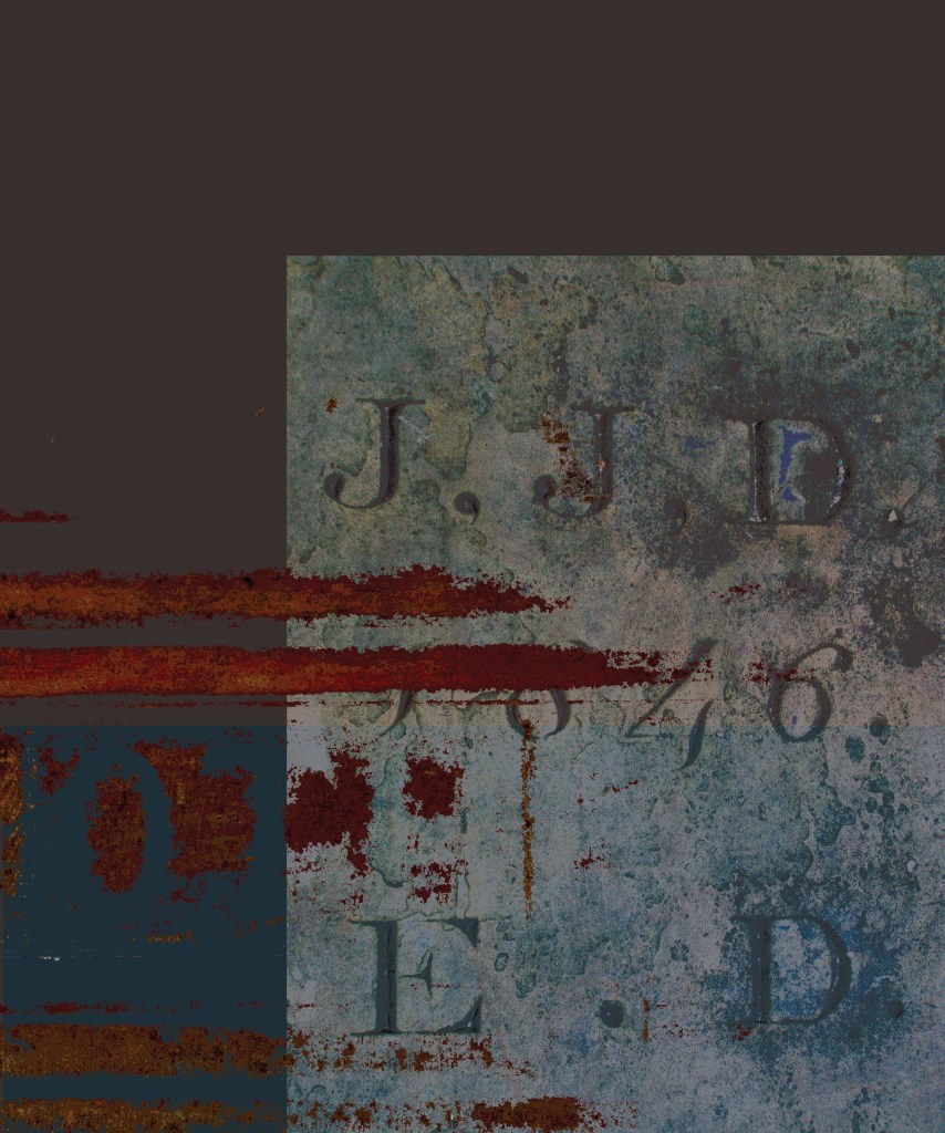
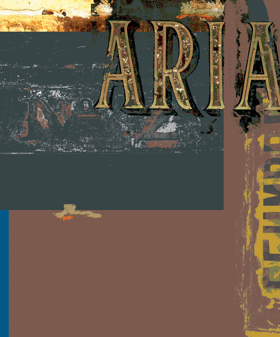
City of Letters: Cambridge series 2009
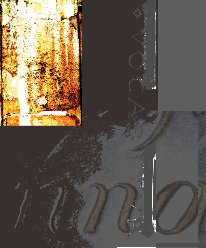
These prints were created for a one-man exhibition at the Clare Hall Gallery, Cambridge University in 2009. Dr Catherine Dixon was kind enough to write:
‘Forms both cast and carved emerge through depths of overlaid colours rich with the patina of wear and decay in an exquisite series of prints which celebrate the material physicality of letterform characteristic of so many of the city’s historic spaces and which prompt our own act of re-seeing the familiarly invisible’
This work was the subject of a cover feature in the journal Ultrabold.
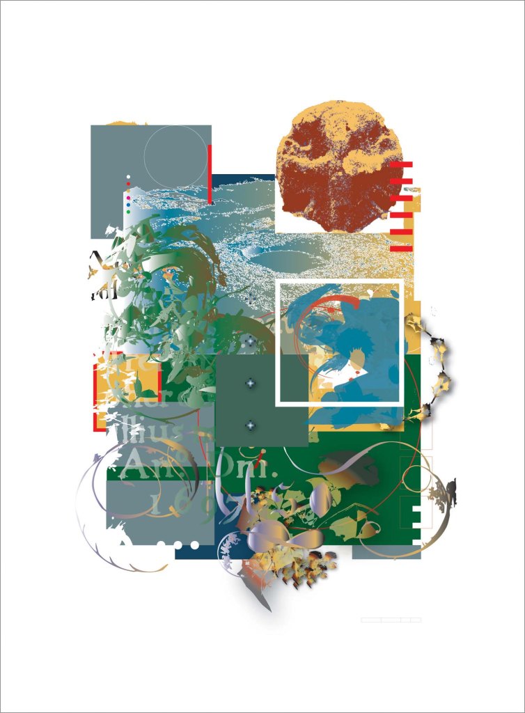
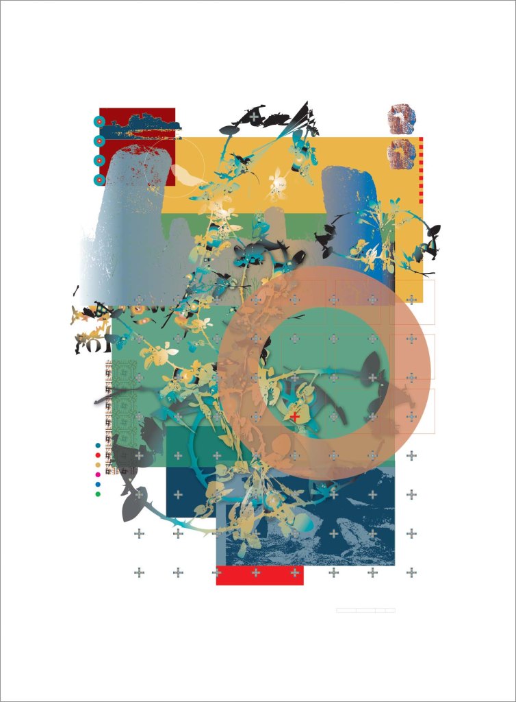
Landscape and Memory: Cornwall 2009
These three prints were created in response to an invitation to participate in the group exhibition ‘Landscape and Memory’ curated by Mack Manning of Manchester Metropolitan University, at UWE Bristol Gallery, University of West England, in February 2009
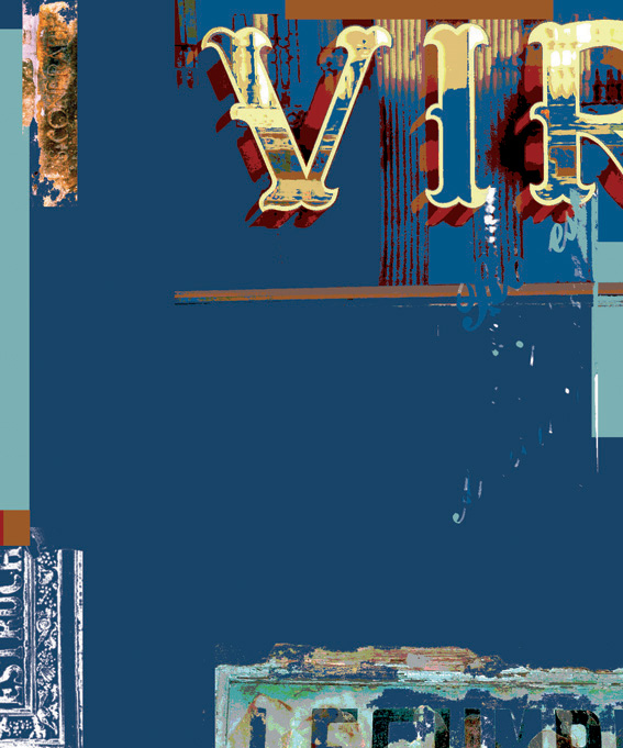
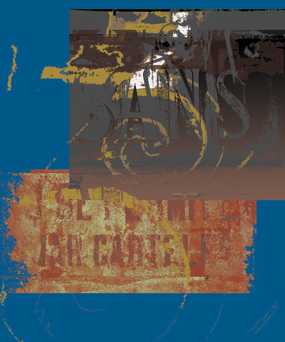
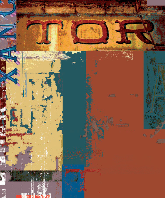
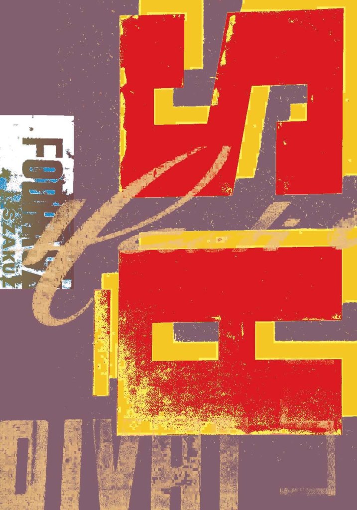
Barcelona series 2008

From the late 1990s I had been making large-format digital prints inspired by the street typography of cities. Barcelona proved a rich resource of back-gilded shop facias, in various states of decay.
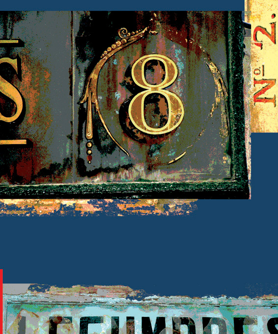
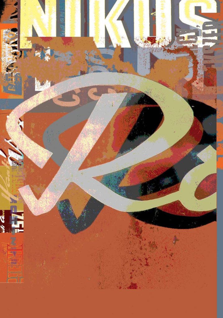
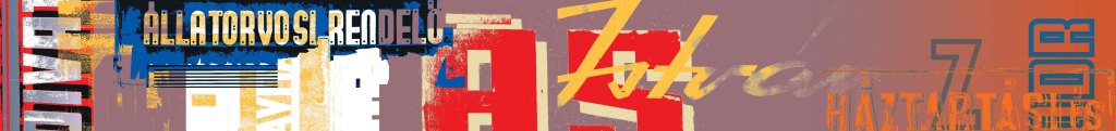
Budapest series 2006
I first visited Budapest in 1995 and was immediately impressed with the distinctive qualities of the signage and street typography. This was to be the subject of a conference paper I presented at St Bride’s Printing Library in 2006, subsequently published in the journal Ultrabold. These prints are derived from photos I took on my first trip and on subsequent visits up to 2005.


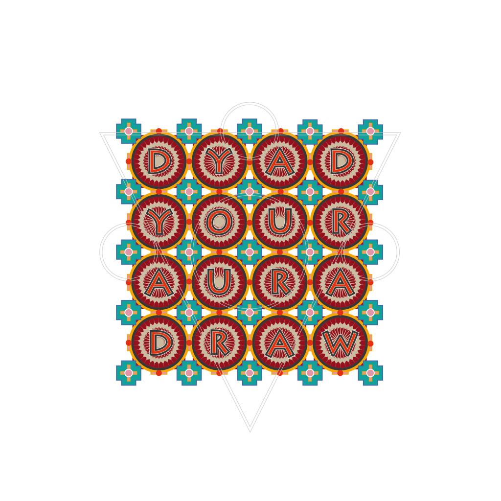
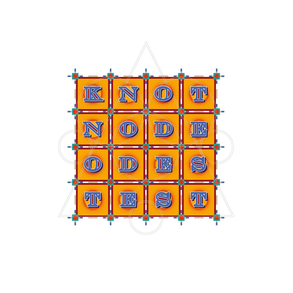
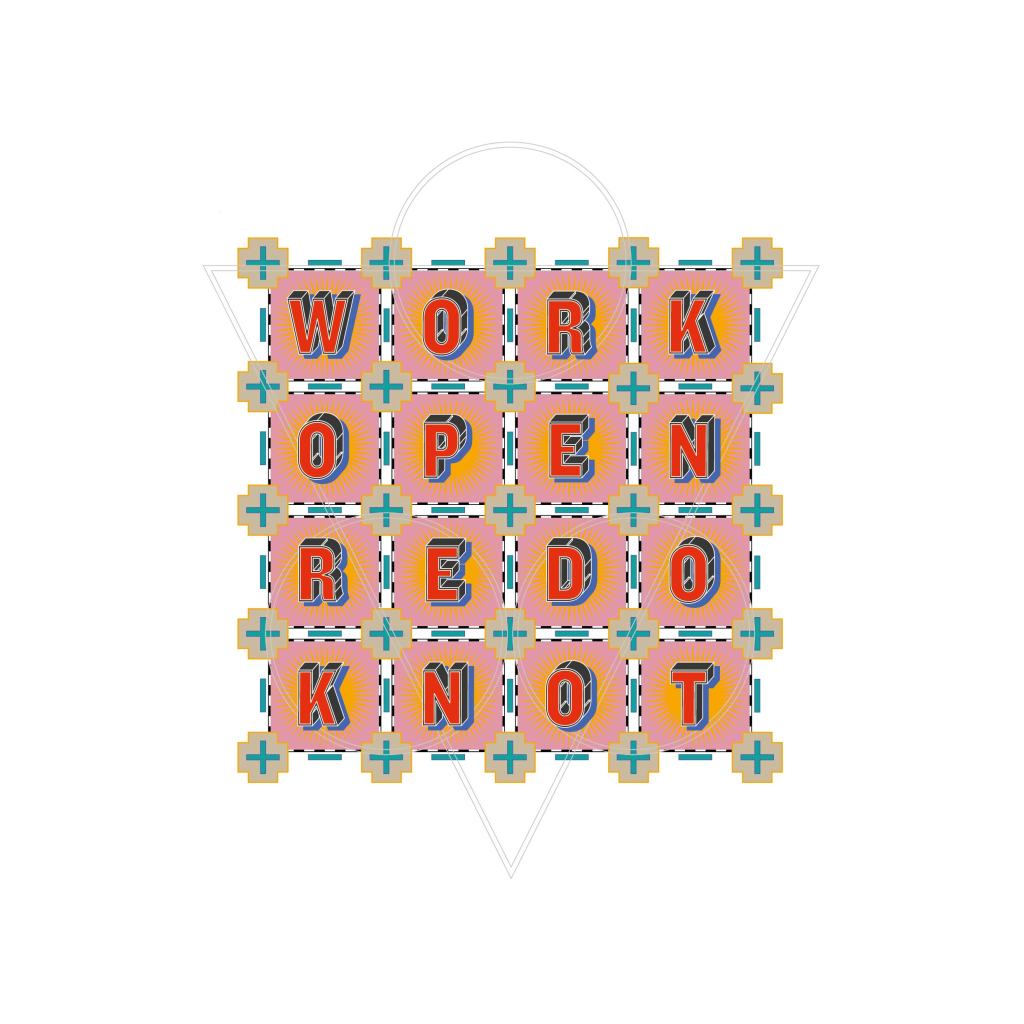
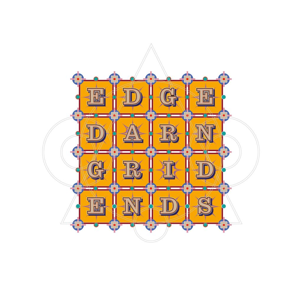
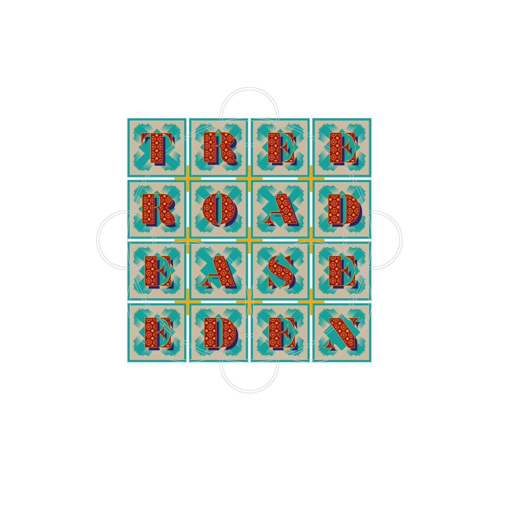
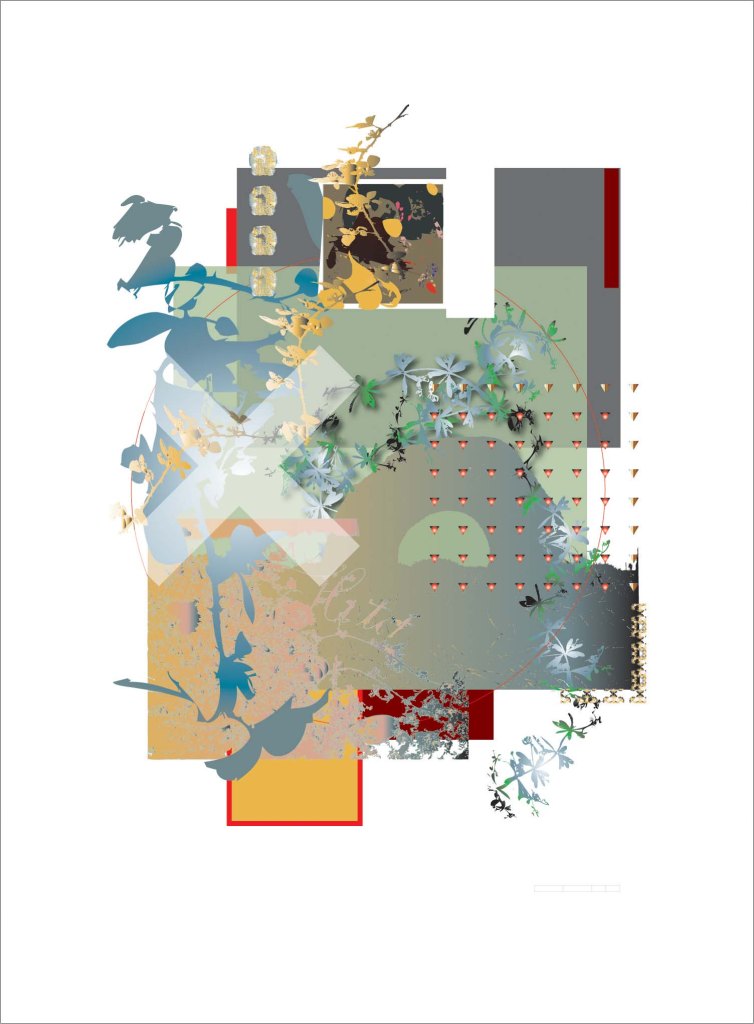
Dyad (in collaboration with Richard Berengarten) 2022
I have collaborated with the poet Richard Berengarten (ne Burns) on a variety of projects ever since he instigated the Cambridge International Poetry Festival in 1974.
Dyad is a book of 32 acrostic poems, each comprising four words of four letters, published in 2023 by Knives Forks and Spoons Press, a selection from which is shown here. Twelve prints from this series were exhibited at the 30th Anniversary Letter Exchange conference in Cambridge.